

Cutting Edge carried out the DI colour grade and traditional film-style opticals for ‘The Great Gatsby’.
Cutting Edge Transforms ‘Gatsby’ into Living Colour |
|
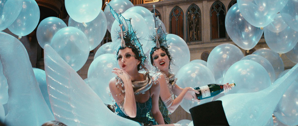
Cutting Edge carried out the digital intermediate colour grade and traditional film-style opticals for Baz Luhrmann's ‘The Great Gatsby’. Nine of the facility’s artists worked on the project for nearly five months, led by Adrian Hauser, Senior Digital Intermediate Colourist, and Hugh Seville, Lead Flame Artist. Delicate ProcessCutting Edge’s contribution centred on the set-up of workflows, the DI stereo grade, opticals design and creation, and theatrical deliverables, all supplied in stereo 3D. They also developed some of the conceptual work as the production continued to expand the project in post. |
 |
|
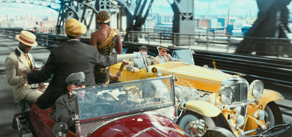
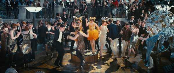
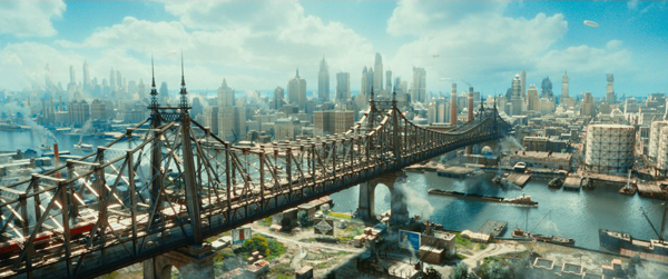
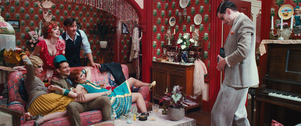
Director Baz Luhrmann said he wanted to use the grade to express the vibrancy and colour described in F. Scott Fitzgerald's novel. Adrian Hauser said, “While appearing heavy handed in its approach to colour and light in the final theatrical presentation, the 3D grade on Gatsby was in fact a delicate process, enhancing the colour nuances of producer/production designer Catherine Martin’s and DP Simon Duggan’s work.” He explained that a large part of the process was setting styles that would maintain the colour palette in lower stereo cinema light levels, which can bleach colour from the screen and tone down the image. 3D from Start to FinishBecause the project was shot natively in stereo on the RED Epic, Adrian set up DI, grading and 3D finishing workflows that conformed, aligned and graded the material in 3D from start to end, working on the Baselight grading system. Another consideration was that about half the film was to be returned from visual effects vendors as Log DPX sequences, which required a scanning/transcoding process for the live action footage that was nearly identical to theirs. |
 |
|
All files were transcoded from the R3D Raw originals at 2.5K to either EXR or, in Cutting Edge’s case, Log DPX format. The team performed numerous tests to make sure they were getting the best colour and grey scale reproduction and perceptual sharpness out of the transcode process. Cutting Edge has now completed the DI for three stereoscopic feature films, including Cane Toads and Happy Feet 2. “During that time, 3D theatrical presentation standards have improved to the point where we can pretty much guarantee what the film will look like shown in different 3D projection and screen systems like RealD, XpanD or Dolby,” Adrian said. He has found that each of the 3D display systems has its own traits and inefficiencies such as silver screen hot spots, light loss, bleached colour reproduction, ghosting and tinting in the highlights. With testing and experience to understand the differences, he learned to master and calibrate images to show them at their best on all screen types. He said, “In the case of ‘Gatsby’, getting the best image meant we had to make the stereo aspect of the DI our priority in the process and consequently we conformed and graded the film almost entirely in a 3D environment from the start. |
 |
|
 |
|
 |
|
 |
|
“There are three basic considerations to the stereo finishing process - convergence adjustments, 3D left eye / right eye geometry alignment tweaking, and the addition of floating windows over foreground objects that break the screen edges. This was all achieved on the Baselight DI timeline and considered part of the grade. Because we were grading and previewing in 3D these operations actually had to be performed from the start of the DI to make for comfortable 3D reviews.” 3D Multi-layer FinishingAdrian was also incorporating numerous 3D multi-layer dissolves, resizes and transitions, which were mostly all finished and stereoscopically sweetened in Baselight. Again, making the conscious decision at the start to conform and grade in 3D also made creating the multi layer transitions, dissolves and resizes fairly straightforward. “In Gatsby these moments were stylistic reprises that required foresight and testing to achieve what the production was expecting,” he said. “Baselight at its heart is actually a basic compositing system with very strong colour grading abilities, so to be able to utilise these tools and keep things live and flexible on the DI timeline was extremely helpful to the DI and stereo finishing process. The same process applies equally to 2D as it does 3D projects.” |
 |
|
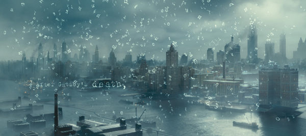
To cope with the continuous rolling conform, the Cutting Edge team developed an automated stereo conform workflow that, for 95 per cent of the project, rolled directly with the edit updates as they were delivered. Inevitably, they reached a point near the very end of the project when they had to do some manual updates on the timeline. A flood of VFX shots arrived within the last few days of the grade. With last minute tweaks coming through from editorial as well, all teams were handling tasks that even a very resilient workflow would struggle to automate. But they adjusted and, having designed the backbone to the conform, were able to respond quickly to the changes manually, on time. Two separate 3D outputs of the movie were supplied, one for the industry standard 4.5 FL, and another for special presentation screens that can deliver 7 FL. Classic OpticalsCutting Edge was also instrumental in the creation of the film’s opticals, which is the name given to visual effects in the early 20th century that were achieved in-camera or as a device to literally add and overlay titles and graphics onto movie images by using an independently shot piece of film. Hugh Seville, Cutting Edge Lead Flame Artist said that Baz Luhrmann wanted to create sequences that he called ‘poetic glue’ composed mainly of multi-layered graphics, dissolves and transitions. He decided that the idea of ‘opticals’ best described the sequences, and that traditional filmmaking techniques were the only way to achieve the desired look. “In a sense we were using the same process but with a digital result,” Hugh said. |
 |
|
A good example of the process was the ‘After Gatsby's Death’ sequence. The original concept contained nine words floating off a page, which then grew into a few hundred words, which then grew into thousands of letters bursting off the page and raining over the New York skyline. Other optical ‘poetic glue’ sequences relied on integrating text into final VFX deliverables from the various vendors. Animated by Hand“All the text elements were to some degree created by hand. Fonts were hand written, retraced and animated by hand. Textures were shot and composited as part of the final optical result. Flame was used exclusively for the sequences. Its editorial and FX composting tools really suited the work, especially when it came to the use of text in a stereo environment. “My contribution to the design of the opticals was a collaborative process,” Hugh said. “Baz and Catherine Martin often had clear concepts of what was needed to be expressed in some sequences and others were left open for me to interpret and design. Often I would translate approved concept boards into stereo, while other optical scenes were driven by editorial and audio. The final look we achieved is something I don’t think could have been achieved without the collaboration of so many artists.” www.cuttingedge.com.au |
 |
| Words: Adriene Hurst Images: Courtesy of Cutting Edge/Warner Bros pictures |


