


Colourist Charles Bunnag talks about his experiences of moving from the world of VFX, to colour grading VFX blockbusters, and shares ideas on what makes an ideal image.

The Mandalorian
Light Iron, the post-production creative-services division of Panavision, recently hired well-known colourist Charles Bunnag to their team of artists. Charles has had the opportunity to work on some of the most popular movies and television productions in the past few years, including a number of VFX-heavy blockbusters. Among his recent credits are the series ‘The Book of Boba Fett’ and ‘The Mandalorian’, and the movie 'Avengers: Endgame'.
For the last decade, he has worked with veteran colourist Steven J Scott as colleague and mentor – the two of them worked together on 'The Lion King' and 'Bad Times at the El Royale' as well as Oscar-winning films 'Roma' and 'The Revenant'. Charles and Steven also earned an HPA Award nomination for their collaboration on 'Avengers: Infinity War'.
Through those experiences, Charles has developed his own creative and technical approach to colour grading. Digital Media World had the opportunity to ask Charles about making choices as a colourist and how he looks at each project, sequence and image to tell the story in the best way. For instance, at a glance, it might seem as though grading a Marvel blockbuster or a space adventure movie would be a very different experience than grading more subtle stories, but Charles doesn’t see his work in those terms.
An Image that Works
“I believe the fundamentals of what makes a good image remain – line, shape, texture, form, colour and value – regardless of the subject matter. As long as you’re using those elements correctly, you’re going to have an image that works. Whether you have a spaceship flying past a planet blowing up, or simply two people having a conversation at dinner, they’re still composed of the same elements,” he said.

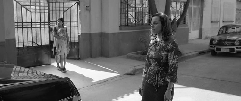
The Lion King
The biggest difference he finds is the sheer volume of work in the big blockbusters. The shot is usually higher, with more deliverables such as international versions, 3D and HDR, and promotional material beyond trailers and commercials. A large-scale project may need a bigger team of creatives and, even if the colourist is involved early on with tasks like VFX plate timing, the actual finishing schedule can be quite compressed.
But, regarding the similarities, Charles always comes back to the fundamentals of imagery and story – adjusting, enhancing and manipulating images according to what will best tell the story. He said, “Those basics really do create a solid foundation to work from. I also think of them as a toolbox with everything I need. As long as I don’t overcomplicate the project and stick to the fundamentals, things generally work out.
“Personally, I always try to make sure that everything is following the rules of how light works, at least in a believable way. I make sure the contrast levels obey the rules of atmospheric perspective, and that the light appears to be bouncing off surfaces as it should. Movies obviously aren’t real, but need to feel real. Incorrect contrast ratios can quickly break the realism of visual effects or change the emotional intent of a shot.”
Sensitive Situation
Previously, Charles worked at Company 3, Technicolor and EFilm. Prior to his career as a colourist, he was a matte painter and VFX artist for features and television. A graduate of California State University, Northridge, where he studied art and illustration, he credits his background in traditional artistic techniques as crucial to his process today. He has also been a speaker at the SXSW Film Festival and has served as an instructor at Gnomon School of Visual Effects in Los Angeles.

The Revenant
He has learned how, for fully CG or VFX heavy feature films, the focus needs to change compared to live action. It’s critical for him to be aware that an army of artists and a VFX Supervisor have been iterating each shot with great intention to get it to its final stage. Eventually, their work will be dropped in his lap, leaving him in a potentially sensitive situation.
“They may have spent the last year creating an image that I could change in just a few seconds. A lot of trust has to go into our collaboration, so I try my best to understand where the VFX Supervisor is coming from, what the team is looking for and what struggles they’ve had to deal with," Charles said.
VFX Extension
“With a live action movies, completely changing the look of a scene, such as a day-for-night, is not so uncommon. But a VFX heavy or fully CG movie has already been very carefully crafted to reach an intended look. While the colourists are there for colour correction, we’re really an extension of the VFX team -- enhancing the look, not changing it.”
Charles will always recommend visual effects plate timing in pre-production. In that process, all of the shots in a sequence, or the entire movie, are lined up and graded as closely as possible to match the final intent. This way, each VFX artist knows exactly what they are working towards. These days, VFX heavy productions can be so large that different artists working on similar shots may never even meet, and end up producing different results simply because the plates each one was working on were shot just a few hours apart.

Colourist Charles Bunnag
His own background in visual effects, of course, helps create that necessary level of trust with a VFX team. “I can speak their language and have a common point of reference," he said. "As I mentioned, handing off the shots they’ve put so much work into can be nerve racking because they know how much their look can change during the colour grade. So, knowing that I can relate to what they’re feeling is reassuring.”
Squint Your Eyes
While working with Steve Scott on Roma, he discovered that working on a black and white project can also be a learning opportunity. Taking away the colour element forces an artist to truly be aware of composition and value. Colour may distract viewers from potentially weaker parts of an image – without it, they can absorb the image faster, whether they realise it or not.
Charles said, “Director Alfonso Cuarón mentioned that his movie 'Roma' was his chance to ‘work in grays...[like] Ansel Adams’. One could argue that a tool we were accustomed to, colour, had been taken away from us. Consequently we really had to double down on our ability to work with values alone. Working together, Steve and I quickly learned that our assignment was to be a greater extension of Alfonso's vision for the cinematography than is normally called for during the DI.
“While we couldn't change the camera angles and lenses, we could help increase depth, shape the image through complex windowing and roto, and help guide the viewer's eye through what is known in illustration as the ‘implied line’. Obviously, we can’t draw arrows on the frame that say ‘Look here’ but, to borrow a term from old school photography, through the use of precise, intricate dodging and burning, we can guide the viewer's eyes through the shot and show them where to look without making them they are being told to do so.
Roma
“If you squint your eyes and blur your vision, an image breaks down to its basic forms, and in that composition of vague shapes, the implied line can easily be seen, whereas before, it was only felt.”
Lustre
Charles has spent most of his career working on an Autodesk Lustre grading system and loves the way the colour moves and feels in the application. He especially likes its keying tools and its true keyframe editor, which makes its control over roto and other keyframe related tasks very powerful.
“Lustre will always have a special place in my heart because it’s the system I started on," he noted. "A lot of people, including myself, can find it intimidating when first starting out because it looks a lot more like a compositor, but there are certain features that I love and haven’t been able to find elsewhere.
“However, a few years ago, I started working on DaVinci Resolve as well, and quickly began to appreciate its speed and flexibility. It’s enjoyable to use, and because it’s familiar to many other creatives, Resolve helps me communicate with them through a common language, as a point of reference. I hear a lot of good things about Baselight as well, and I'm curious about its tools and capabilities.”

Avengers: Endgame
Problem Solving
Thinking about tools again recalled for Charles the value of his traditional arts training. “A traditional artist, in my case an illustrator, always starts with a completely blank canvas (or whatever medium you’re working in) and turns it into a finished project. A big part of that process is problem solving," he said.
“In contrast, colour grading involves me at the finishing end, after the cinematographer and many other artists have already done so much to get the shots quite far along. I get to now focus 100% of my efforts on the finishing stage and apply all my problem-solving efforts there.”
Charles is anticipating working with and getting to know the people at Light Iron. He will work out of Light Iron’s Los Angeles facility, and be able to collaborate with clients globally through the company’s remote collaboration services. “Everyone here is skilled in techniques and approaches that I’m not used to, which means there’s a lot I can learn," he commented. "It’s a great advantage to be surrounded by so many talented artists, so I look forward to absorbing all they have to share and finding how all of that will complement my approach to colour.” www.panavision.com/post-production