


Colourist Mark Mulcaster at Sky Post Production worked on Baselight to bring together archival and modern purpose-shot 4K footage for this emotive documentary on fighter Ricky Hatton.
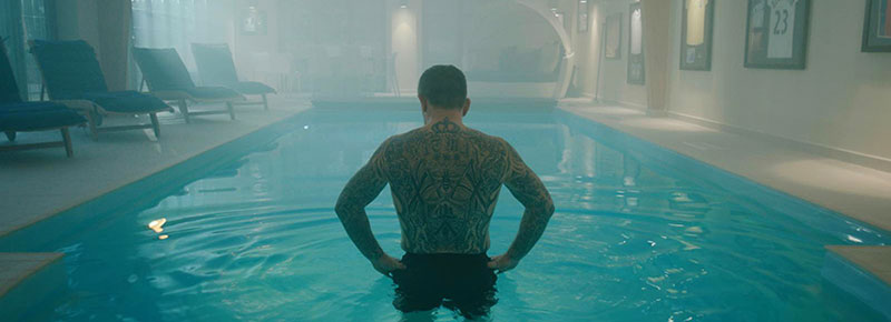
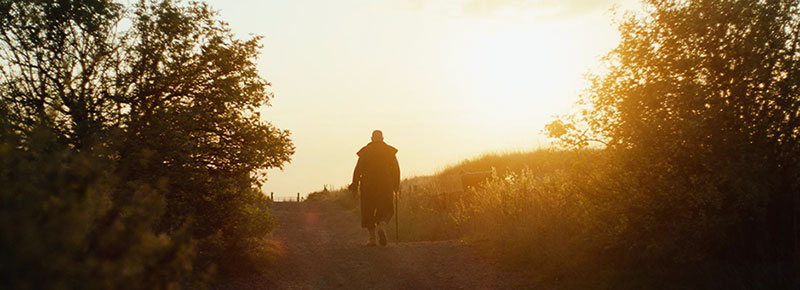
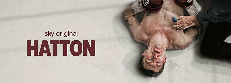
The documentary series Hatton looks into the personal and professional life of Ricky ‘The Hitman’ Hatton, one of the UK’s best known fighters who earned his reputation against such international rivals as Kostya Tszyu and Carlos Maussa. The series includes previously unseen archive footage and covers many difficult aspects of his life such as depression, suicide and shame, following his story from his childhood near Manchester to the major fights of his career in Las Vegas.
Sky Post Production delivered final post on the production, which is directed by Dan Dewsbury. The facility’s colourist Mark Mulcaster was responsible for the colour grade, which earned him a place on the shortlist for the Broadcast Tech Innovation awards in the ‘Excellence in Grading (Non-Scripted)’ category. Hatton is available to view on Sky Documentaries.
Early Start
The turn-around for grading documentaries is often very fast – some Sky News examples are graded, signed off and delivered in less than a day. But for Hatton, Mark entered the project early, during the offline edit, which gave him the opportunity to start look development remotely while the director locked in the edit. The full grade took place later on at Sky, where Mark completed the work on a FilmLight Baselight system over a period of four days.
“Having a longer run-up on Hatton was a real gift and enabled us to do a lot with some lovely set-ups,” he said. “For documentaries, there’s a fine line between keeping the grade honest with some stylisation, and letting the colour bias the viewer’s perspective – unless, of course, that’s the brief.
“Dan’s a fantastic filmmaker and he wanted to create a very authentic film look, so we discussed the colour separately to the texture of the image. Part of this was done in camera with the use of Pro Mist filters, with the rest achieved using diffusion in the blacks and shadows via tools like Baselight’s Texture Equaliser. This was employed to soften parts of the image rather than sharpen.” Texture Equaliser divides the image into individually adjustable spatial frequency bands and lets the colourist control the interaction of colour and texture.
Together they decided early on that there would be two aspects to the look – one for the archive content, which was extensive, and one for the interview footage, where they agreed a softer look was called for.
Intervews, Continuity and Storytelling
The nature of the documentary meant that the interviews were conducted over the course of several months and while the production team did what they could to maintain continuity, some of the interview set-ups had natural light that wasn’t easy to control on the shoot.
“We had to work hard to achieve a consistent feel across A and B cameras, which at times were cut together from different points in production,” said Mark. “Some of the shots required dynamic lighting changes in the background, independently from the subject, so we had a number of shots with keyframes inside and outside of a key.”
Some of the environments allowed the team a chance to really build the emotion that they wanted the viewer to feel, from the warmth and security of girlfriend Jennifer Dooley’s living room in Manchester, to the almost Godfather-like settings for some of the boxing promoters in Las Vegas.
“Ricky Hatton’s interview was made to feel a lot cooler than it actually was, and setting it at the end of a long table in the kitchen created a sense of separation and isolation from the story,” Mark noted. “The cool blues and teals worked well with the chrome of the kitchen.
“For the most part we kept the film fairly natural although when the story moved into discussions of embezzlement, we made some of those involved a bit greener to create an off-kilter perception – and then returned to our normalised grade once that story had been resolved.”
Into the Archive
The second aspect of the grade was to help the archive footage sit better within the cut using colour and texture, especially important because the film was cut together from mixed media. The newly acquired interviews shot in 4K contrasted with standard definition sports archive and Hatton family DV footage from the 1990s.
“We spent time discussing how we could enhance the archive footage and push it subtly towards the look of the rest of the film,” Mark said. “At times, archive material from different dates and sources was intercut so we needed to homogenise it and reconcile anything that stood out as too different. In addition to a good balance, we wanted to add a bit more density into some colours, in particular blues and reds, without letting them pop too much.
“Sometimes we even had to slightly degrade the archive to sit within a sequence. For instance, the final picture lock used a couple of drone shots that were added into an archive sequence and they needed much more work as they looked so crisp and modern in comparison.”
The aim was to maintain the ‘video’ feel, so although he added a bit of grain for consistency, he also added a very subtle amount of Baselight’s Chroma Warp, which gave a good basis for any additional effects added in the online. Again, doing much of the legwork on the grade before the attended sessions meant they could focus more on bringing everything together.
Experimenting
Mark had requested a test sequence early on that was representative of the edit, allowing him to set to work on the looks before the grade began. The team’s experimentation was interesting and took them from some very authentic film print emulations to something a bit more stylistic with warmer highlights and skin tones. Meanwhile, cooler tones were pushed into the shadows to add visual appeal to the interviews. Then, after locking in the look, they started to explore the texture of the images, experimenting with different grain stocks and plugins.
“We opted for Baselight’s Add Grain operator, as this gave us very precise control over the size, intensity and amount of grain as well as which part of the image was being affected,” Mark said. “I blended the grain using an overlay function so that it sat within the image rather than feeling like a layer over the top.
“Add Grain is my preferred operator for creating grain. When you combine that with layer blending, it gives you a lot of options without having to add additional grain sources which won’t carry over from Baselight into Avid via a media-less AAF workflow, which contains information, metadata and links to media, but not the media files themselves. Layering up the various steps into a stack allowed me to simply blend back many layers with precision and so if we wanted to increase by 10% or back a layer off by 20%, it was easy to do.”
As Dan wanted to create an image with a filmic texture, Mark also explored ways to incorporate some halation layers. Halation is the attractive effect resulting from the bright areas of an image appearing to softly bleed around the edges of dark areas. “It’s not something you can get with digitally acquired images and usually I don’t have the luxury of time to add halation,” he said. “Some of it is very subtle and at a couple of points we may even have over done it, but we felt that it worked so we went with it!”
Mental Boxing
Dan also shot some abstract scenes in the middle of a council estate at dawn, with Ricky in a boxing ring. Mark wanted these to feel totally separate from the rest of the film, as they were used to imply Ricky mentally revisiting some of his fights and his internalised thoughts.
“We didn’t want to use black and white or sepia for this so opted for more of an unsettling magenta tone, which really enhanced the early morning feel when the footage was shot,” Mark said. “We increased the amount of grain in a blended layer and pushed the Chroma Warp a lot harder than we had for the rest of the film. I did some selective sharpening and then blended it back onto the graded image, which created this cool blue and purple look while giving me precise control over how much we needed to dial in.
“It was fantastic to work with such a great team, both from the production side and at Sky Post. It was a big, exciting project and I was really pleased with the result of the grade as well as the collaboration between myself and Dan. It’s always rewarding and satisfying to work on a film with a director who has such a clear vision yet allows you the time and space to creatively explore the visuals.” www.filmlight.ltd.uk