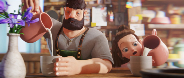
Production company Gentleman Scholar produced a 3.5-minute animated short film on which DDB Canada and Dairy Farmers of Canada have based an integrated campaign to help raise the profile and public awareness of Canadian cheese. The campaign launched in April on the Canadian Cheese YouTube channel when the short debuted alongside various 15 and 6-second cut-down versions. It can also be seen below, and on the company’s microsite.
According to the agency’s brief to Gentleman Scholar, the campaign was to suggest that the creativity of Canadian cheesemakers is what differentiates Canadian cheese from imported, European cheese. Instead of pushing traditional craftsmanship, they wanted to promote the idea that Canadian cheese makers are drawing on the varied traditions, people and tastes that make up Canada’s society.
The short film titled ‘Mia and Morton: A Story of Canadian Cheese’ features an aging cheesemaker in his shop and his daughter, who also becomes his enthusiastic apprentice. Year after year, while Mia grows up from a child to a young woman, Morton's original cheeses always narrowly miss receiving top honours at the annual international cheese championship. But Mia continues to inspire and encourage her dad and, finally hitting on the magic combination for a number one cheese together, they win first prize.
Since the main goal was to demonstrate craftsmanship in the Canadian dairy industry, the client and agency wanted to bring emotional attachment to food made at home by fellow countrymen and inspire people to be part of that culture, buy locally and so on. Gentleman Scholar's creative directors William Campbell and Will Johnson stayed close to the project’s initial script, emotional arc and many of the highlight moments.
Diving In
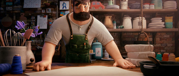
William said, "One of our key contributions was helping to capture the essence of time passing, and visually communicating the changes in the relationship between Morton and Mia. In fact, a huge part of our pitch was how the characters would evolve. How do these characters both change and stay the same through time? That was an amazing emotional journey to be able to dive into."
"While we met Morton and Mia in the script, when it came to their personalities, what their backstories were and the nuances of their performances, all of that was left for us," Will said. "We completely involved ourselves in the character development, the world building, the development of their spaces and the textures of materials. We brought life into Monty their cat as well. Creating the look and feel of the characters as a family unit was really important, and how their personalities came through in the animation."
Highlighting the difference between Mia and Morton was also critical to the brief. A separation was created between them through their relative youthfulness and energy. Mia uses her energy to create something new and exciting, whereas Morton is more systematic and prefers to approach tasks and challenges in the way he knows how.
Because Mia changes quite a bit from the beginning to the end of the film, they tried to imbue her with an identifiable personality from the beginning. This was a task that took a lot of time during the R&D stage. William said, “We had character layouts that passed through all the stages of life. How does her face change? How does her wardrobe stay similar to tie things together? This was done very early on, knowing that it would be a challenge.”
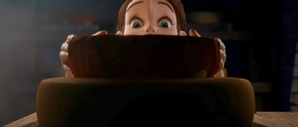
Will also remarked, “We made sure we maintained a continuous thread of a child’s curiousity in Mia even as she gets older. She’s always a curious kid, interested in the world around her, and from there we made sure that personality carried through to her animation. Also, we let the design language influence the character rather than looking for references from the past.”
Unicorn
Interestingly, a search for animation references wasn’t an element of this project. Instead of trying to pull references from outside sources, the directors let the process of designing their characters inspire the way they move. “Having been fans of animation as well as animators throughout our lives, we decided to let their traits like demeanor and posture result directly from their character development,” said William. “Talking about them, designing their body shapes and building up their personalities as they are described in the scripts – all of this work fed into their animation.”
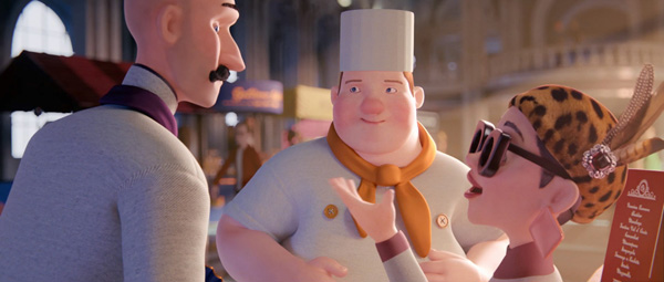
The directors, Art Director Paul Kim, CG supervisor Tim Hayward and the producers spent considerable time on pre-visualisation. The short has no dialogue, which meant keeping the visual story simple and true to the brief. Will described it as a ‘unicorn’ type of project for them because, compared to their usual high-pressured world of creating short projects and commercials, they had an opportunity to take extra time for a thorough pre-vis to develop look and story. “We explored camera angles and figuring out how long we should stay on shots. What do we see in shots? We spent a lot of time with storyboards, animatics and rough animations,” he said.
Striking a Balance
Surrounding these characters and their story is the overall look and style of the project. Certain aspects, especially the light and textures, are photoreal but others, like the character models and some of the animation, are more stylized and expressive than realistic.
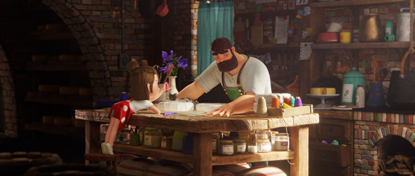
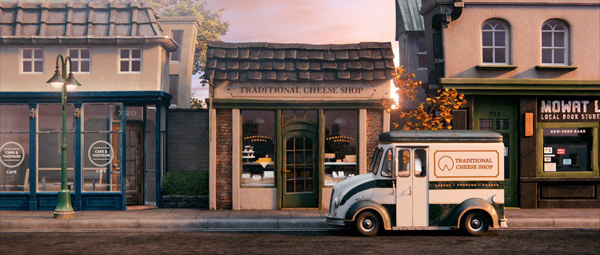
Will said, “Striking the balance between art-directed looks and photoreal textures and materials had two sides to it. First, we defined the look with agency in the design and pitch phase. The story would unfold in a realistic space that felt tactile and tangible, like a place that you could reach out and touch, where we could bring in the characters’ personalities and soften them up by characterising different components of their personalities. Mia would be more fluid and softer. Morton would feel bigger, stronger and traditional.”
This groundwork opened the door for a more creative, secondary process to flow. “Because the client was quite open with look, and was relying on us to define it, our experience in both animation and live action was what determined the balance,” William said. “Design sensibilities came through in character design. Realism, on the other hand, comes through in lighting and the emotion, and how physical that might feel – which is to a large degree is based on our experience in live action production.”
Iterating the Visuals
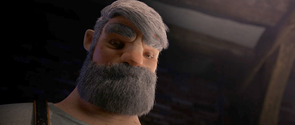
Their animation pipeline employs Maya for the modelling, texturing, lighting as well as the animation. Photoshop and some of the other Creative Suite softwares are used in the design stages. Nuke is the compositor and, on this project in particular, Redshift was used for rendering.
This choice was made mainly due to the emphasis on sophisticated visual storytelling. Given the project's length, quality control became an internal challenge. "Animations always look a lot different from the greyscale pre-vis to the render because you’ll only notice certain details once you see them fully rendered," said William. "Redshift is GPU-accelerated, and by performing so much faster than tools we've used in the past, we had a chance to iterate further and see more work-in-progress earlier on. Redshift had a big impact on the way this project turned out."
Redshift was used not only for look development but also throughout the entire project. He said, “The lookdev / lighting setups from Redshift took us right into animation scenes. Having that ability made a long project like this possible. Some of the standout looks we were able to establish started with scenes from the pitch, for example, the wide shot of Mia and Morton sitting at the table together. The sunlight is beaming in with a hazy stream of light and light is glowing on their faces. It really helped nailed down their characters.”
When Design Meets Cinematography
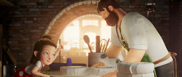
The directors are pleased with how the emotional storytelling plays out in the finished film. In fact, they came from an animation background before moving into live action, and now work in both types of production with equal ease by using the skills from one type to enhance the other. Will said, “We have been fans of animation our whole lives and take pride in being able to combine the two directly. We can take that live action experience and bring it into the CG world, and don’t need a designated DP. We can apply it to the choice of lenses and camera angles, for example - what angles will help us feel the emotion of Morton? We found a balance between what should come through the design language and what was more cinematic.”
“We can also carry out the look dev for the lighting and animate the pre-viz at the same time and, from there, it’s on the creative director’s and Art Director’s shoulders to blend the two in their minds,” said William.
"This project is a case of our live-action experience and on-set understanding of character development playing into the animation side," Will said. "We're still deciding on lensing, the angles, sequences and establishing shots, and meanwhile everything we have learned in animation feeds our live action. Now in this case, live action comes back and feeds into the performances and the thoughtfulness of the CG storytelling." gentlemanscholar.com


