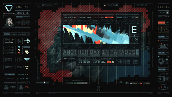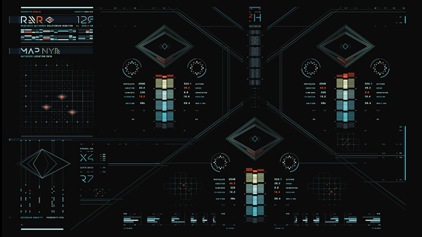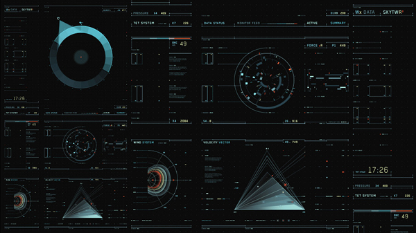
A team of motion graphics artists created the expressive, intuitive HUDs and Light Table animations appearing in ‘Oblivion’. Two of them describe their process.
OBLIVION: MOTION GRAPHICS |
|
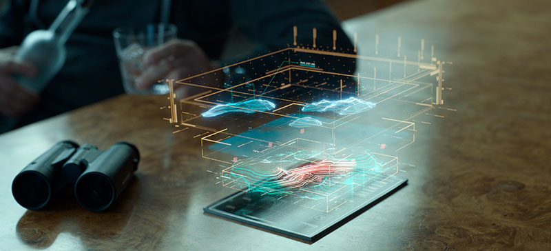
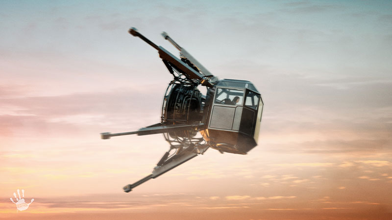
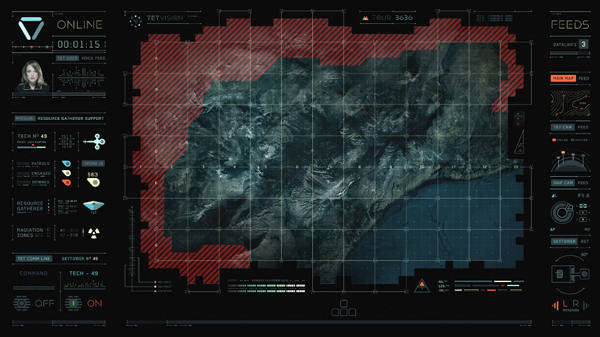
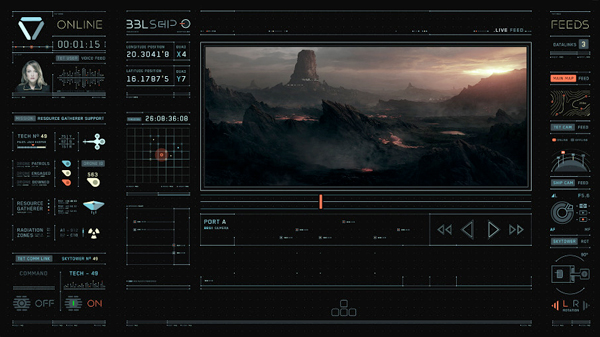
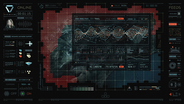
Lead Graphic DesignerBradley Munkowitzexplained that his team’s involvement with ‘Oblivion’ was a two-part process. The first, taking up about three months, began before the shoot because some of their motion graphics had to be designed to literally be played back and shot on the Sky Tower set with the actors, as part of the live action. Director Joe Kosinksi’s goal for ‘Oblivion’ was to capture as much as possible of his movie in camera including the elegant glass Sky Tower interior, all in natural light Interactive Light TableThese graphics were to be shown on television monitors incorporated into a large, interactive light table that forms a major element in this science fiction story. The light table functions as a central briefing centre providing critical information to assist the characters with their duties on Earth. Comprised of four screens, the light table displays a large map used to monitor the position of the Bubbleship, the aircraft in which character Jack Harper travels to and from Earth. |
 |
|
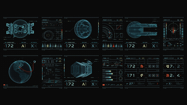
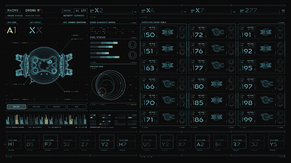
The table also monitors the movements of alien scavenger, or ‘Scav’, and drone vehicles, and tracks the drones’ function and fuel statistics. A hydro rig monitor displays the collection progress of water resources, and a weather screen reveals changing climate conditions. While graphics animatorDavid Lewandowskicarried on with animations for the light table work, the second phase of the project, a round of post production work on the Bubble Ship and other HUD effects, got underway, a three to four month job. The team was responsible for designing the concepts for all of the graphics themselves. Joe was confident enough in the team to leave this part of the work largely up to them. He had given them some reference, typography samples and sounds he liked that would be relevant to his vision. From there they experimented and developed specific looks. |
 |
Graphic LanguageBradley said, “We familiarized ourselves with the look and feel of the way the graphics would appear in the film by looking at Art Department sketches, storyboards and working briefly with the previs department. Although it didn’t directly inform our designs, it gave us parameters to understand viewing angles, shot layout and so on. “What also influenced us throughout the project was working inside Joe’s office at Crater Lake Productions alongside the full production - from the producers and lead editor to the VFX editors, pre-vis artists and sound mixers - all working physically close together. The arrangement was actually helpful when developing a coherent graphic language for the project.” |
 |
|
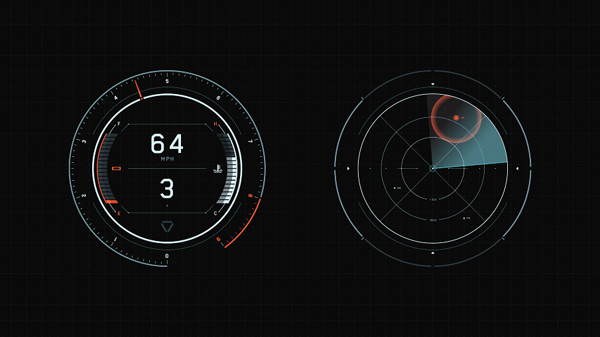
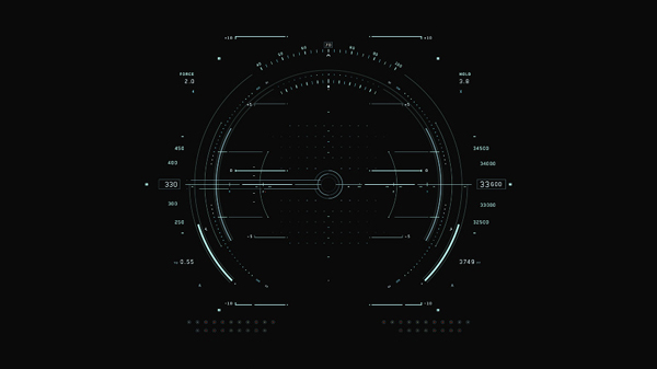
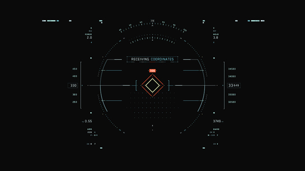
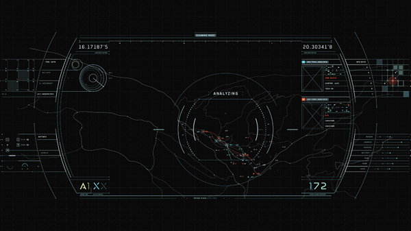
They wanted to make the designs and animations all feel related to the mothership called Tet that Jack and his partner Vika continuously work and communicate with. The light table and the Bubble Ship and drone HUDs had to feel bound by the same Tet technology, while the opposing Scavs graphics, on the other hand, had to look alien and divorced from the Tet aesthetic. Aviation ReferenceMuch of their reference for the HUDs came from aviation equipment, specifically flight simulation systems. While the light table work resided in a familiar zone for the team because they were essentially display graphics, which are typical tasks for web and graphic designers, the Bubble Ship HUD work was a little newer to them. |
  |
|
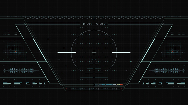
“We wanted the HUDs to feel as real-world as possible, not jarring, something that might be seen in a helicopter, pilots flight simulator software and fighter plane games. Military interfaces were very useful to us because they were minimal and functional without clutter, made for efficiency,” Bradley said. He had gathered a folder of 6 to 7 GB of video clips and illustrations to work from, aware that thorough research is the best way to give a UI genuine realism by understanding what makes it work for users. Joe, of course, was keen that the graphics feel linked to the user as well, that is, to the characters and action, and often reminded them of this at reviews. He trusted them to handle the design and looks but wanted to control the storytelling aspect. Bradley remarked that, personally, he would have liked to have developed their interactive qualities beyond the fairly simple dragging, sequencing and on-off functions, but stayed within Joe’s guidelines. |
 |
|
The motion graphics pipeline was kept relatively simple on this movie. On TRON, the team had been more diverse had included a Houdini artist, an open Frameworks artist, a Cinema 4D artist and After Effects animators. For ‘Oblivion’, because much of the work was delivered as flat screen graphics, they relied on Illustrator and After Effects with some Cinema 4D. David Lewandowski in particular was usingCinema 4Dalmost exclusively for the light table files. VFX Hand-overAfter completing all of the HUD animations, they passed off the designs and renders on black to Pixomondo and Digital Domain, whose visual effects teams would then integrate into their shots, applying camera blur and any further effects themselves. They had some initial meetings to show their designs to Pixomondo, responsible for building the Bubble Ship, and look over samples of their composites. |
 |
|
The graphics’ animation was a major factor in making the graphics both distinctive and well-grounded as a feature of this story. As animation director, Bradley developed his core behaviours and style cues from Joe’s brief before instructing the artists. From there, he would let the individuals experiment, add their own flavour and ideas, and develop extra excitement. Bradley had taken the same role and led almost the same team of artists to design and animate the motion graphics for ‘TRON: Legacy’ for Joe Kosinski. Bradley remarked, “When we were working together on TRON, our focus was quite intense and experimental from the start, and the fact that it was each of the artist’s first feature film added to the pressure. But ‘Oblivion’ wasn’t such a hard-driving, intensely challenging project for us. It was a more methodical, balanced and efficient kind of project. What made it interesting and inspired our commitment was the unusual application of the graphics within the production.” |
 |
Team DynamicsWhen David Lewandowski, who was also on the TRON team, started out as a graphics artist ten years ago creating motion graphics for television, he had never actually thought in terms of working on films. But with ‘TRON: Legacy and ‘Oblivion’ now behind him he believes the pool of talent and interest from producers are large enough to support much greater use of motion graphics in movies. “Projects like ‘Tron’, ‘Total Recall’, ‘Prometheus’ and now ‘Oblivion’ are leading to more interesting, appealing looks and refined animation as well,” he said. David found that working with pretty much the same team as on TRON and continuing with the same team dynamics was a benefit. He said, “I was working on the Sky Tower light table graphics in the film, and started in early 2012 leading up the initial shoot. We were still designing and animating elements while Joe was out on the Icelend shoot before shifting to Baton Rouge.” |
 |
|
As David read through the full script, studied sketches and gained a clearer idea of what the audience would be seeing in shots, he also realized that this was quite a different project from TRON. Instead of the big holograms, they were designing flat table graphics for playback on set during the shoot. Joe was committed to using a practical approach to the shoot as far as he could. Whereas TRON’s world was digital, dark and cold, Joe sought a physically realistic, brighter, more colourful atmosphere for ‘Oblivion’. Functional DetailsHe knew the light table was to be built on-set with a curved glass surface comprising the four monitors and four separate screens. But while these details defined the limitations of the on-set playback, otherwise they had only story points to proceed with. Bradley, with motion designer Jake Sargeant, laid out the core design of the map that the characters would access on the table, while David worked out the on-screen transitions, how the map would move and the pace of the ‘blinking’ in the tile windows, speed of the processors on the theoretical computers and so on. |
|
|
|
He said, “The light table and map needed a lot of attention to small functional details. Though the primary goal was to follow an aesthetic and tell a story, the whole system also had to make sense and seem real enough to avoid looking like an abstract navigation device.” David estimates that the map design required the longest development phase, about three months, of any part of the project. Furthermore, as they began, the script was still undergoing revision and casting was underway. These changes impacted the graphics in unexpected ways. For example, the camera lingered at length on one particular corner of the map for several shots, so that David wished he’d had a chance to devote far more time to that one corner. “When concentrating on longer, large-scale projects, it’s important to watch for external clues like this,” David reflected, “so that you know what’s actually going to count in the result – not just what you want to focus on in the studio.” |
|
|
Rogue SignalAnimation took David another three months or so to complete on his Mac, in particular the confounding rogue signal that brings down a space shuttle, and the data analysis displays for the drone. The rogue signal was a major story point and completely open to David’s interpretation, apart from a single reference. Joe had told them, “OK, tell us what this thing looks like.” It was developed to include multi-coloured rotating strips of pyramids that help identify Scav signal feeds. Some other story points they worked on were a Morse code sequence Jack uses to communicate to the Sky Tower when he’s in danger, and the DNA bio trail that helps the light table identify fragments of his DNA. Typically, David finds motion graphics teams are hired by a visual effects company working on a film, so that information and feedback from production has to work its way through as many as 10 people, causing more chance for misunderstanding. |
|
|
|
Video clips of Sally, Vika’s and Jack’s contact from the Tet mothership, needed to be incorporated into the map display as well, and until these arrived from the shoot he used jpeg placeholders in the design. These clips were then played back on set as part of the completed file. As mentioned, David usedCinema 4Dfor nearly all of his work and then composited in After Effects. “Although it may have been possible to do it all in After Effects, personally I find it easier and produces a more interesting result to use Cinema 4D. I was using the MoGraph module and tools for 3D tasks, plus 2D bits of design. Even when creating elements that end up on a flat screen, CINEMA 4D has a UI and fast rig creation that worked really well to generate original, futuristic-looking animations quickly with a small team, or just one artist.” Motion Graphic CharacterThe light table graphics files were delivered to the company handling live playback on set. Although using playback avoided the need to composite the images onto the reflective glass monitors in post, considerable effort was needed to get the whole arrangement running perfectly on set. Someone had to trigger the animations, the actors’ performances had to match, and the camera work had to coordinate with everything. It could be tricky, but once they were captured, the shots were essentially done apart from the grade. Joe’s experience on TRON, which took three years to complete, influenced his decision to proceed differently with ‘Oblivion’, especially since the motion graphics appear in such a large portion of the movie. |
 |
|
Actually David was somewhat daunted by the prospect of capturing the graphics on set this way. How successfully would they shine through in the final shots? Wouldn’t the giant glass table with the white skies surrounding the Sky Tower overwhelm the animations? Consequently, he tried to make his blacks as deep as possible and hoped the colourist could isolate the monitors closely enough to control the balance. Because this light table is Vika’s and Jack’s only contact with Sally and Tet, representing their home base, throughout their lives, it becomes a kind of character on set. The framing and presentation became significant. David feels that the contribution of the motion graphics to its presence in the story, as well as their development and sophistication, opens the way for similar characters in future films. |


