|
om Bryant first heard of The Lost Thing project while working as a freelance 3D artist in 2006 at Passion Pictures in London, where the project had gone through some initial early development work. “At the end of the year I moved to Australia to live for a year, assuming my involvement with the project would end when I left the UK.
Opportunity
“But in Australia, Sophie Byrne contacted me and asked if I would like to work on the project, directly with her, Shaun and co-director Andrew Ruhemann in Australia. I thought it was an excellent opportunity and started work immediately, modelling and texturing the huge list of character and environment assets. When I moved back to the UK at the end of 2007 I continued to work remotely on the project from my studio in Scotland.”
Tom has been working in the CG animation industry for the past 10 years in similar positions, although he has seldom had the opportunity to cover such a wide range of roles in one project. “Usually I'd be focussed on one task, modelling and texturing on one project and then lighting and compositing on the next. This is the first project where I've has such a level of responsibility for the final look and production of all the final frames for the film, especially without the safety-net of an IT infrastructure in a larger organisation. It was an exciting challenge.”
Big Little Project
“Character modelling for the project was actually fairly straightforward in terms of the basic models. Shaun provided great sketches of each character, which I used as reference to build the 3D models,” Tom said. “We usually needed a couple of revisions per character to iron out issues either of us had with the design or my interpretation.
“Concept artists often give you characters designs that look great on paper but won't work in the 3D world, but one of the bonuses of working with Shaun was that his designs were all well thought out and considered, both in aesthetics and function. The main challenge was the sheer number of characters involved. It's rare for a small production to have such a large range of characters and environments.”
Speechless
Because the characters don’t speak or have a wide range of facial expressions, Leo didn’t need to rig and animate the faces, and their shapes fell to Tom. For the characters that required some facial movement, he used the tried and tested CGI method of morph targets. “For all the main characters, which were the Boy, Pete, Mum and Dad, I created a range of morph target shapes for the facial features, eyes, eyebrows and so on, that could be combined in different ways to create the desired character expression. Leo could then animate these morph expressions during animation to produce the required movements.”
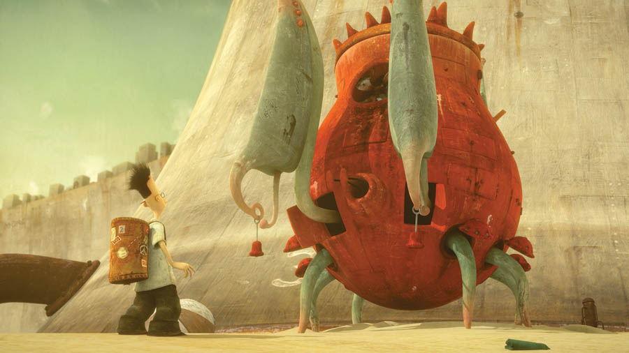
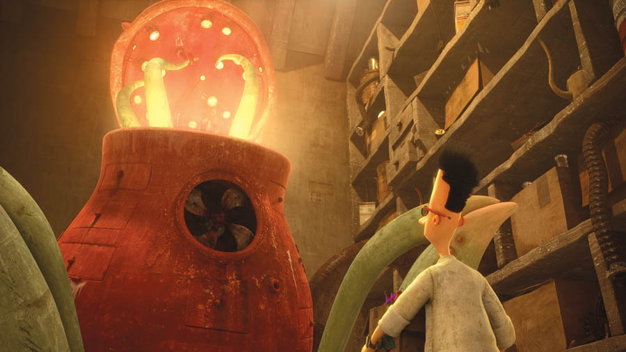
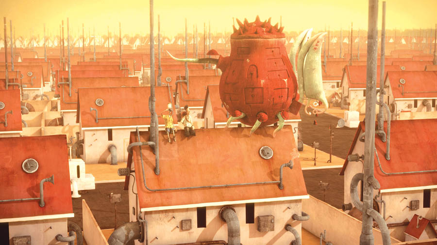
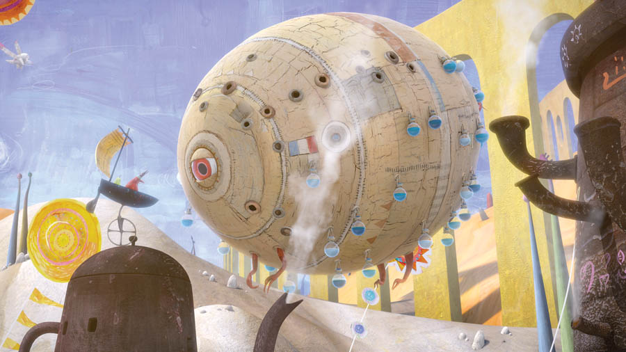
The original model for the Lost Thing itself was modelled by Antoine Moulineau during early development at Passion Pictures in the UK. Once Tom arrived, they made a few edits, slight proportion changes and tweaks to the model’s geometry layout, added internal parts and gave it distinctive textures, although the basic shape stayed the same. “Antoine got it pretty much spot on and Shaun was happy with it. The Lost Thing was the first character model that I textured, so it was used as an integral part of the textural look development for the project,” Tom said.
“One thing that really helped the project is that both Leo and I are pretty experienced in what we do. I was able to model the characters in a way that made them easy to rig for animation without further modifications. Leo was able to rig them up as needed, without having to come back to me for changes. On the rare occasion that Leo needed a character ‘s elements to be rearranged, he'd tell me the changes he wanted and I'd mirror those edits on my render models.”
Colour Scripts
Shaun had a vision that every scene would have its own distinct colour, to convey the intended mood. For most scenes, Shaun provided excellent colour scripts, which Tom could combine with the original illustrations of the book as reference for the lighting style of the film.
“At the texturing stage, we decided that I would present the environments to Shaun for approval with a full, initial version of the final lighting and compositing in place, so that Shaun was approving the textural feel, the lighting and the composting of each environment in one step. We called these render-boards - basically they were single frame renders of the storyboard panels. This workflow also meant that at the end of the texturing stage we would have a first pass of the environment lighting and compositing scenes already set up for most of the cameras in each scene, which was a big time saver at the lighting and compositing stage.
Render Board Process
“This 'render board' process was an important step for us to take on the project. I could be confident fairly early on that we were on target with regards to the overall look and feel before the official scheduled 'lighting' stage had even begun. On some projects the look of shots is still being finalized right before delivery, which we just couldn't afford to do with our limited computing resources.”
Due to the timeframe, they decided to light and render a few scenes at Passion Pictures Australia. Having these 'render board' scenes set up and ready to go meant that the lighting artist in Australia could plug his rendered frames into the composites, follow the set-up for lighting and compositing the characters and start to produce final frames that would match the pre-approved lighting styles.
Hand-Painted Textures
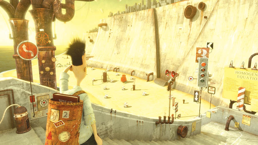
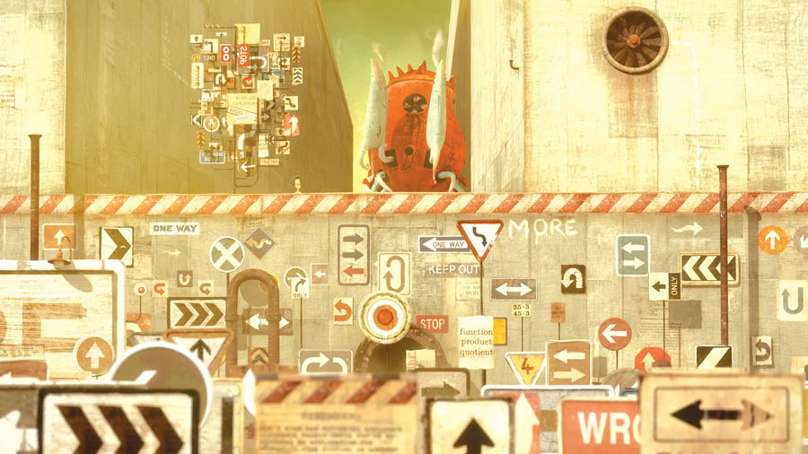
The brief from Shaun regarding the textural look and feel of the whole project was to make the models “like puppets”. The textures were designed not to look exactly like the intended surface but more to be 'representative'. For example, rusty pipes weren't textured using photographic metallic rust source material. Instead, Shaun provided high res scans of hand-painted texture source material, which were representative of the surfacing that he wanted to be used on the characters, environment surfaces and details that he'd like to see in the film, like signs, wording and so forth.
Tom used these to construct the actual surface textures for the 3D models, sometimes directly, using areas of the texture scans, re-arranged to fit the UV layout of the 3D models. Often, especially on the environments, combinations and variations of several were used to provide a wider range of surfaces and to prevent the viewer from noticing textures repeating and appearing in more than one environment. He also often incorporated areas of actual photographed real-world textures to add more detail and variation.
|
|
Character Looks
“For the characters, Shaun had a very firm idea of how he'd like the textures on each individual character to look, so we adopted a more specific workflow for this stage,” said Tom. “I'd send Shaun a basic grey render of the finalised character model, which he would edit in an image editor to overlay and mask the desired texture samples in 2D over the relevant areas of the character render. He would then send me this modified 2D image with any new scans of painted texture samples that he wanted to be used for that character, which I would then use to work up the full 3D textures and surfaces.
“I think that the lack of clothing wrinkling was both an issue of time and budget and also stylistic. Following the puppet brief, we decided that more rigid clothing would be appropriate for the film, especially since wrinkling, pinching and flapping clothing effects would take a lot of time to create and animate on so many characters.”
The same approach applied to the skin and hair. Shaun wanted the skin surfaces to look as if they were painted wooden puppets, although Tom added some skin subsurface light scattering to the skin areas of the characters. “Some characters have more traditional fibre-based hairstyles and some characters have more solid geometrical hair. As long as the style was representative and recognisable as hair for the character involved, that's what mattered.”
Wobbling Edges
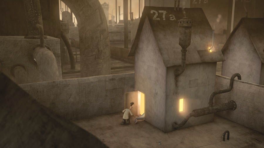
The main challenge in transposing Shaun's vision of his world to a virtual 3D environment was that there were to be no straight edges, anywhere at all. This was an attempt to draw the feel of film away from the traditional clean, crisp lines of some CG animation. “In fact, if you look carefully, I don't think there's actually a straight line in the whole film,” said Tom. “Every edge wobbles and every circle is made irregular. While this did add some time to the modelling process, it really helps to create the feel of a 'real' world, albeit an imaginary one!
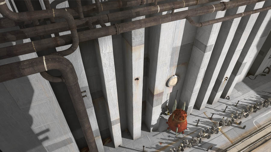
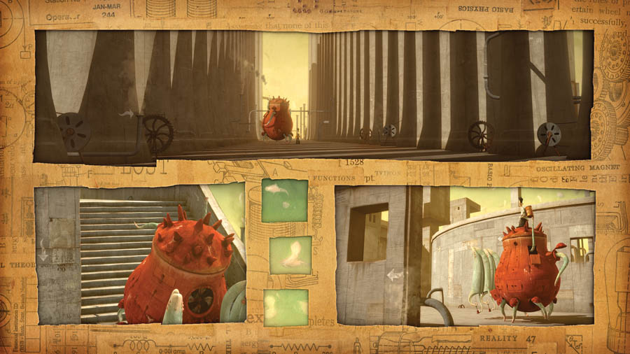
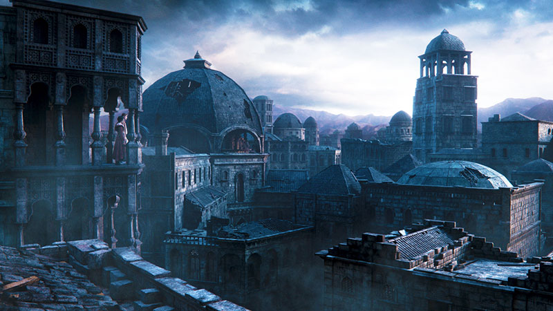
“I often had to artificially distort buildings and environments to enable them to fit into shots the way that Shaun imagined. Since a lot of the shots were originally imagined and composed in a 2D sense because Shaun had limited experience dealing with the 3D animation process, I had to adapt the 3D to match. Some obvious examples would be the buildings of the search scene. There's a lot of forced perspective going on with the buildings in a lot of those shots. Again, it wasn't the physical correctness of the world that mattered with this project. In-frame, everything had to balance out and draw the eye to the correct place. Every shot was constructed almost as if it were an image or painting.”
Render Farm
Softimage XSI was chosen for the project as a complete, 3D animation package that both Leo and Tom were very familiar with. Nuke was the primary compositing package due to its speed and flexibility on high resolution footage and native linear colour-space work flow. Tom also used several Tinderbox effects plug-ins for Nuke fairly extensively for the film’s effects.
The Foundry supported the project by providing Nuke and Tinderbox licenses for the duration of production. ReelSmart motion blur was used to produce motion blur as a post-process in the composite. Tom said, “We decided to do all motion blurring in the composite as it's much faster to render the CG passes without motion blur and then apply it in post. The result isn't quite as high quality or as physically correct, but it's still very good, and the quality worked with the stylistic nature of the project.
“From the start, it was fairly obvious that I'd have to implement a pipeline allowing us to create something visually beautiful with limited resources, both in terms of manpower and computing resources. I built a small render-farm in my studio in Scotland with just four computers to render all CG and composites that I was assigned to complete there - all but three of the final scenes. The last three were finished off during crunch-time in Australia. In the end, just about the whole film was rendered and composited on just four computers.
The HD Decision
The project was initially intended to be produced at standard definition. Tom said. “The decision to produce it at HD benefited the final product, but meant much more work in terms of level of detail required in texture creation and also rendering and storage overheads. For a small production like ‘The Lost Thing’, it was a big decision, but definitely worth the extra effort for the textures and environments in the world we created.”
To be able to make major changes to the colour and mood of shots without having to re-render many of the CG lighting passes, Tom kept the lighting fairly simplistic and used multi-pass rendering. Then he carried out most of the colourisation, grading and look development of each shot in the actual composite. This has the advantage of making changes in the composite in 2D, generally much faster than in 3D.
He also used Softimage's render-channel capabilities which can split separate render elements such as diffuse, reflection and specular elements off into different image streams from the one initial render pass. “This helped keep the rendering to a minimum but give us more flexibility to tweak these separately in the composite. RGB masks were also rendered to allow more flexibility to tweak these all separately in the composite. For any particular shot there could have been 10 to 30 separate source image streams in the composite, depending on the complexity and number of characters in the shot involved.
Animator Found
Leo was familiar with Shaun’s work and eventually heard that Sophie Byrne, the producer at Passion Pictures Australia, was developing some of his work as animated content. Tom had already prepared many of the CG assets and the production needed an animator. Inspired, Leo pursued the opportunity.
Shaun had never directed animation before, and Leo wanted to offer him as many of his ideas for the character performances as he could in the form of references to other objects, animals or people, moods or styles, believing this was the best, clearest way of communicating his impressions. The two of them got on well and Shaun welcomed his ideas.
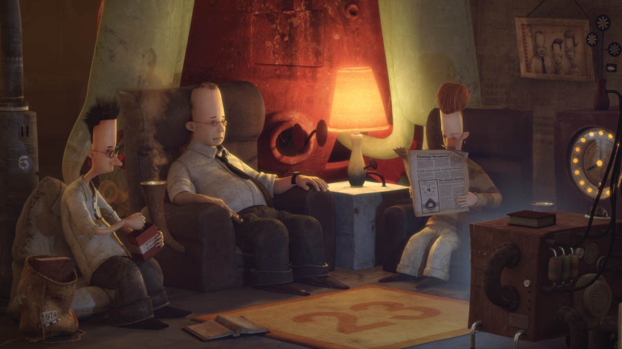
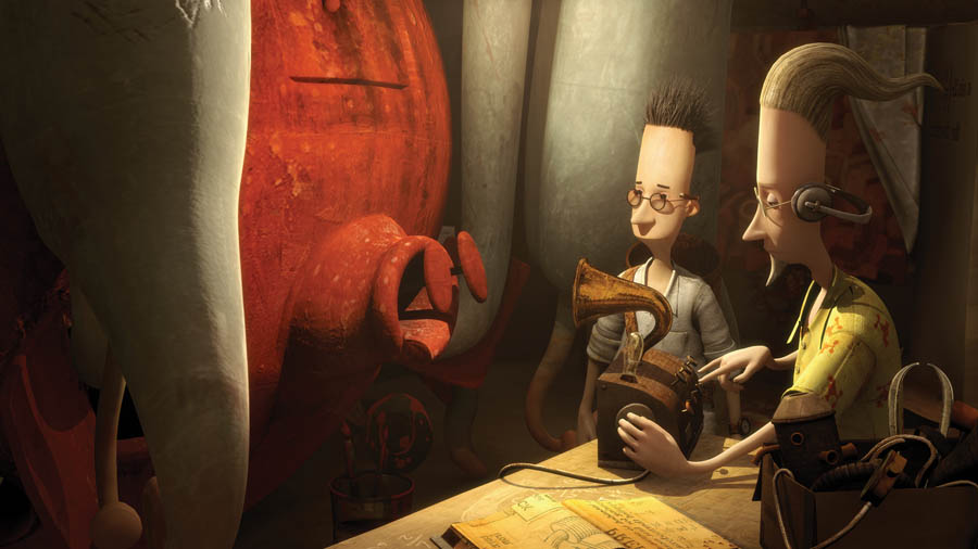
“Shaun’s briefs were fairly open-ended but on some points, he had clear ideas of his own,” said Leo. “For example, most of the ‘human’ characters in his world are muted, unexpressive types with restrained slightly robotic movements. Their emotional content was well played down. This was handy because many of the ‘secondary’ background humans could use the same animation rig, which meant I could apply various template animations for walk cycles and expressions.”
Teapots and Crabs
Most of the true character animation work went into the Lost Thing itself. It was an odd shaped character, leading viewers to ask, “What is it? A teapot, a hermit crab?” Leo said, “One thing Shaun was adamant about was that it shouldn’t be like a crab or spider, which might make it spooky or creepy. Its principle quality was to be friendly, playful and innocent, as a contrast to the other characters, highlighting the wonder in the boy character and the loneliness of the world it has strayed into.
|
|
Leo worked in a small studio above a laundry in Melbourne, near Shaun who met with him every week or so to monitor progress. Leo would make an OpenGL capture of the performances he’d been working on as a low resolution test render, and the whole animation could be reviewed from this. Leo was using Softimage XSI for the animation, which he finds has especially good 3D animation tools for editing and adjusting performance. Also, because a lot of the development had been done through Passion Pictures UK where the team was also using XSI, it was convenient.
Leo and Tom Bryant worked well together, coordinating their individual strengths. Leo has filmmaking skills from camera set-ups to character animation – shot construction, composition, framing, previs, and preliminary through to final animation. Tom’s strengths are modelling, lighting and rendering. Their skill sets were therefore a good match. Where Tom left off, Leo picked up.
Custom Rigging
Leo also rigged the models himself, which helped him get the precise performance out of them that he wanted, and no more. “Because we had such a small team, I had to be efficient. We had more than 75 characters to get through. I think it’s best for the animators to do the rigging. They are the ones using the rigs, and it’s easier for me to just go back and adjust a rig myself if it isn’t working quite right. XSI is useful for working this way.”
Completing ‘The Lost Thing’ required about three years of preparation and animation for Leo, focussed for the most part on honing the performance of that main character. The only other film that had demanded so much concentration from him on one character was ‘Charlotte’s Web’, shot in Melbourne while he was working at Rising Sun Pictures. “We were responsible for creating Charlotte. For that project, we had to make the character interesting, look like a spider, but also make her appealing to children and not be too creepy. It was a delicate balance with similarities to the Lost Thing, which needed to be an odd, out-of-place character, but still endearing.”
Apart from this, Leo had done VFX animation, small pieces of character animation for various films, and 2D animation for himself. “As tricky as the Lost Thing was to create a character for, those very subdued human character performances were challenging in another way. The performance looks simplistic on screen but takes a lot of thought and trial. I tried to avoid any extreme movements and tone it all down, but you have to be careful not to make it linear and boring.
A Linear World
“I was worried about that, but after talking to Shaun, I found he agreed that it should be a linear and boring world. Whatever was bland and expressionless among those characters, we had to make up for in the Lost Thing as compensation. Once I had achieved that contrast, I knew the audience would understand that those characters actually are boring and that the Thing really is interesting and exciting.
“Since Shaun’s brief on references was largely about what he wanted the Lost Thing NOT to look like, we explored making it wander along like an elephant. Elephants are slow and cumbersome, but not too creepy, scary or ferocious. They are gentle and friendly. Some of its slower walk cycles are elephantine. Another promising reference was a puppy, easily distracted, running in circles, enthusiastic, innocent and loveable, qualities I tried to emphasise in the beach play sequence. This is our first encounter with it, when we don’t know what it is. It looks a bit menacing as it towers over the boy, but pulls out a beach ball and just wants to play.”
Aspect Ratio
Its height was a problem design-wise. It had to be scaled in many shots. In Shaun’s book, the Thing looks huge and the boy is small. This contrast works on a portrait-format page in a book but film formats have a landscape aspect ratio, of course, so showing the Thing full screen next to the boy makes him almost too small. “This affected how I framed several shots and required some ‘cheating’ on the scale on a shot-by-shot basis,” said Leo.
“At that first encounter at the beach, we used a wide angle lens with the boy very close to the camera and the Thing further in the distance. The lens makes the boy look quite large in comparison. The Thing was scaled up three times to create the appropriate relative size for the effect the shot needed. It had to be juggled to fit into some of the other sets, too.”
Because Tom built the sets either according to the book or to Shaun’s Storyboards, the framing of some shots was predetermined. The interior of the parents’ house and Collins Streets for example, were made to match the book, which left only the optimal camera position to define. But generally Tom would build the sets and then Leo would set up the framing together with Shaun.
Distance Production
Shaun was often overseas for his work but the three communicated wither via email or by placing QuickTime movies on an ftp site. Shaun and Tom could pull work from Leo from the site. Tom would pass character and environment models via ftp to Leo, who would then set up and animate a scene in consultation with Shaun. Once the animation was approved, Leo would upload the scenes again. Tom would take them down for rendering and then return the finished Quicktime. Leo really liked this process.
“Many human characters had similar proportion and performances. In XSI, a template for a human biped type of rig. I used this template, which has a standardised naming convention for all the properties, bones and so on that you can use to create template walk cycles. I also used the Animation Mixer, an alternate animation method in XSI used to create animation clips.
Template Animation
“Instead of keyframe animation, you can put animation cycles over the top of a performance. So when you see characters walking through a frame, say on the Collins Street sequence, it shows all the characters using the same walk cycle. There were several clips with variations to use on different characters, such as different arm movements, expressions or head wobbles. Instead of manually animating each character in this case, I could take the character rig and put it in a scene and apply this template animation.”
Nevertheless, all of the character rigs for such characters as the boy, Pete, the parents, a dog and the creatures in Utopia, for example, needed individual attention, including the cleaning contraptions on the beach. Leo kept the rigs simple and controllable, knowing fairly precisely how he needed them to move, giving them just enough control to get an interesting performance out of them.
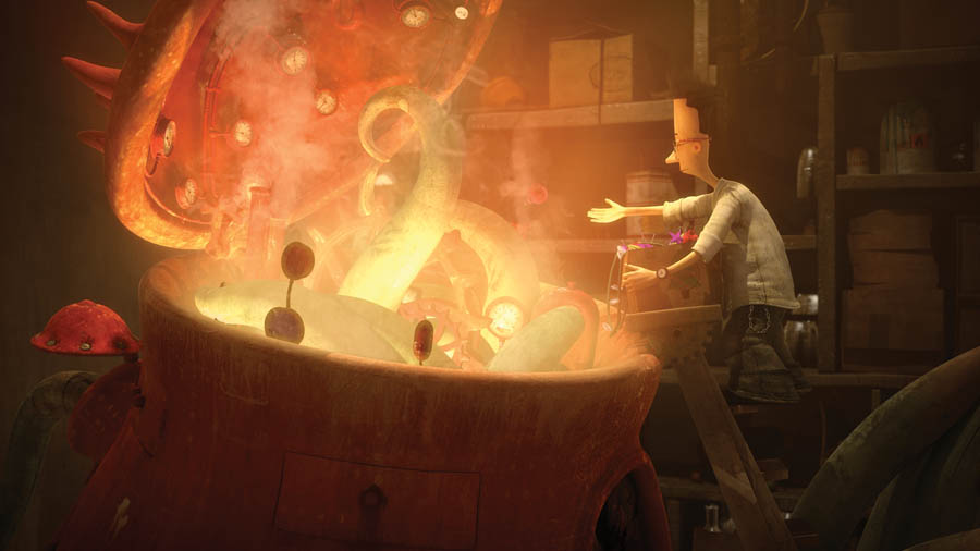
“The Thing looks complex because of its oddity, I think,” said Leo. “But it has no facial expression to speak of, just two small panels at the front and drawers that open and close, then the six legs and a tail. It was a matter of coordinating all these parts to give it a performance. But only the legs had some genuine complexity, with bone chains that had a method to use them in an FK and then an IK mode, but it was quite manageable.”
Faces
Tom Bryant modelled all the facial expression shapes for most characters when Leo arrived on the project. The secondary characters had very limited expressions – they could blink, frown but not too much else.
The movie is narrated but the boy has only one line, “But it’s lost!” which Leo had to animate by mashing together some face shapes before the actual audio was recorded, so they had to try to post-sync it to the sound. “All of Tim Minchin’s narration was recorded after the animation was complete, so I only had a temporary recording Shaun had made of this line. Animators always try to get the lip sync right, so it was hard to have to do it this way!” Leo said.
One benefit Shaun found in turning his book into to an animated short film was the opportunity to explore places and characters in the story a bit further. For example, the hidden Utopian world where the Thing comes from is only a double-page spread in the book, but in the film it received a two and a half minute sequence where you actually get to venture into it a little and see all the characters and details. The film also afforded a bit more back story to scenes. When the boy takes the Thing out to the shed, there’s a chance to show his uncertainty about it, and show the feeding sequence.
For Leo it was great to walk into a project with intriguing characters, modelled and textured – two skills that haven’t come easily – ready to rig and animate. He carried out all of the animation, with a little help on rigging up the numerous secondary characters from Phil Jennings from Halo Pictures.
|
