
Liam Elias at Scholar talks about building a lush environment and characters for client ExtraMile’s campaign, rendered in hyperreal detail with animation that has a tactile, engaging look.

Creative production studio Scholar has produced two new animated commercials in the ongoing series their team has produced for the US convenience store franchise ExtraMile with agency Drake Cooper. Both spots feature the client’s superhero mascot ExtraMan who is busy saving the day in the bustling, glowing ExtraMile world. The spots, titled ‘Fuel Your Day’ and ‘Extragains’, depict what happens when consumers in need of a snack choose ExtraMile instead of falling into yet another queue at the drive-thru.
However, what catches your eye most is not so much the food or ExtraMan himself, but the beautifully crafted environment rendered in hyperreal detail with animation that has a tactile, engaging look.
Scholar’s artists and directors collaborated with the ExtraMile Brand Management team from concept to final delivery to bring their vision to life, giving feedback and helping them to evolve ideas as the project took shape. When the campaign started five years ago, ExtraMan was essentially a re-design with a new personality made to feel more capable, relatable and fun. He has now grown into a universe, and meanwhile the project has helped increase awareness of the nationwide chain of stores and its line of ExtraGOOD products.
Expanding the World
Scholar's work encompassed 3D animation with character, product and environment design, and visual effects. It was about striking a balance between what makes ExtraMile stand out, and creating stories that attract an audience.
"This year, we didn't just refine the world, we expanded it," said Liam Elias, Associate Creative Director at Scholar. "Everything is bigger. Not just in scale, but in life. Every corner of the frame is breathing – people, cars, birds, even bunnies – because the goal isn't to build a beautiful backdrop, it's to build a world you believe exists the moment you look at it."
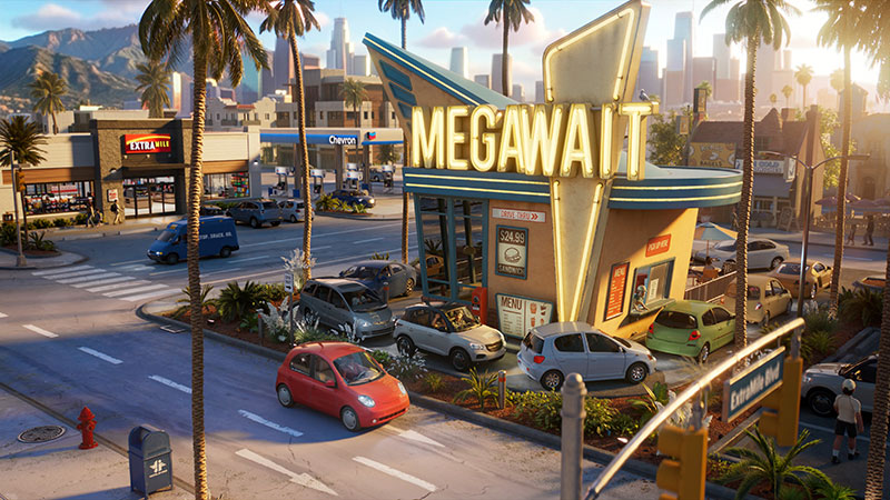
As soon as you arrive, this world has a warm, familiar feeling that comes not only from the product itself but also from scenes that would feel close to home for the audience. They were drawn to the beauty of ordinary places, locations people pass through every day without a second thought. Rather than placing the convenience store in some idealised or fantastical setting, we wanted it to feel authentic, as though it had existed there for years and accumulated its own history.
Liam said, “We found inspiration in local diners in Culver City and Silver Lake as well as neighbourhood intersections, and the everyday streetscapes of Southern California, all of which helped ground the film in a sense of familiarity. Assets like the cars and outfits are very detailed but with features that make them recognisable, in an engaging, positive way. You might think 'I know someone who wears a sweater like that' or 'I see cars like that one all the time'.”
Reflecting Diversity
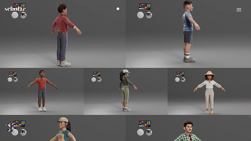
A major part of the design process was thinking about who actually shops at ExtraMile. The brand serves an extremely broad audience, and they wanted the world to reflect that diversity. Rather than idealising characters or aspirational lifestyles, they looked for the authenticity in ordinary moments. “Those recognisable details help create an immediate connection with the audience. Even in a stylised world, we want viewers to feel that these are real people living real lives, which ultimately make the films feel more genuine,” said Liam.
“Knowing ExtraMile’s audience also led us to make the films and animation feel more mature. The brand serves everyday adults on their commute, on their lunch break, on their way to the gym or heading home after work. So, from the start, we wanted the films to feel like something those customers could genuinely relate to, instead of exclusively for children.
“That, in turn, influenced the way we approached materials and textures, as much as character design. The skin, hair, fabrics and environments all lean toward realism because we wanted the world to feel tangible, almost as if it could have been photographed rather than animated.”
With the opportunity to expand the world beyond the ExtraMile store itself, they made sure the design language reflected the brand's personality. “Everything here is just a little extra. The architecture leans into that idea with stretched proportions and quietly absurd details, giving each block its own personality without tipping into cartoon,” he commented.
The vehicles went the other way – compact, almost toy-like, but with modern features that feel like cars people drive to work every day. Liam believes that this push and pull between grand and miniature is what gives the city its texture.

Building with Intent
Another important element was building the city with intention, rather than simply filling the frame. As a result, the scene looks busy but not chaotic – like a real suburb at rush hour. Liam noted that commercial animation is under constant pressure to simplify for the sake of efficiency but, going with the philosophy that ‘more is more’, he believes that memorable worlds are built through thoughtful layers of detail.
“It's about balancing beauty with chaos. The goal isn't excess, it's intentional abundance,” he said. “The right kind of detail doesn't overwhelm. More isn't the enemy. When detail is purposeful, more becomes memory.”
In line with that philosophy, a library was developed of modular buildings, background characters, vehicles and environmental assets that could be recombined throughout the city. Rather than relying entirely on matte paintings, much of the environment is built in CG to retain depth in the world as cameras moved through it.
“We also populated scenes with a diverse cast of background characters, allowing everyday life to unfold around the main action,” said Liam. “The client embraced a more cinematic approach to world building, which gave us the freedom to create environments that felt genuinely lived-in rather than simply functional backdrops for the product.
Client and Product
Of course, the client and their products had to be a priority. For Scholar, it all starts with reference. The first objective is always to recreate the product as faithfully as possible and stay true to what customers would actually find in store. From there, the challenge becomes integrating it into their vibrant, stylised world without making it feel like product photography dropped into an animated scene.
He said, “We were very deliberate about what we chose to enhance. Camera angles helped give the products a larger-than-life presence without altering their proportions, while lighting allowed them to feel at home in the heightened visual language of the film without changing their true colours. We also employed subtle cinematic techniques, such as foreshortening, to improve the readability of smaller items like the protein bars when they appeared briefly on screen.”
Light and Shadow
Lighting is another of Scholar’s storytelling tools – also subtle but perhaps even more influential than character performance for evoking emotion. “It establishes how a world feels even before a character ever moves. Since the team at ExtraMile supported a filmic approach, we had some freedom to think beyond traditional commercial lighting. Shadows, as important as light, could be used to create depth, guide the eye and give an image atmosphere,” Liam commented.
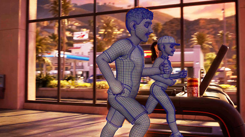
“For these films, we weren't chasing a specific sun angle as much as a specific feeling. We wanted to capture those familiar moments in everyday life – the warmth of leaving work at the end of the day and looking forward to a favourite snack, or the energy of a late afternoon workout when the world seems to glow around you.”
Colour Palette
The colour palette grew naturally from the emotional tone they were trying to create – optimistic, energetic and full of warmth – but they were careful not to let it become overly saturated or artificial. An advantage of working with a brand like ExtraMile is that, because its products and packaging already contain strong, recognisable colours, part of their job was creating an environment that could support and celebrate those colours without competing with them.
“We approached the palette in much the same way that a cinematographer would,” said Liam. “With warm sunlight as the foundation, we could introduce cooler blues, teals and neutral tones into the environments to create visual balance. The result is a world that feels vibrant without being loud. Every colour was chosen to help guide the eye toward the story and the products, while still maintaining the feeling of a believable place where people would want to spend time.”
Camera
The camera work involved continuous decision-making, asking themselves, "Would we shoot it this way in real life?" Liam noted that CG may give you the freedom to place a camera anywhere, but that freedom comes at the expense of believability. Scholar wanted every shot to feel as though it had been captured by a physical camera operating within a real space, preserving the sense of immersion throughout the films.
“That goal also meant tailoring the camera language to the story being told,” said Liam. “In 'Fuel Your Day', the visual concept is built around contrast: the world is stuck in an endless drive-thru line while our hero is free from it. As a result, the camera work is intentionally restrained, allowing the feeling of stagnation to become part of the storytelling.
“In 'Extragains', movement itself becomes the story. The film begins with more controlled, panning camera work before evolving into an arc shot that mirrors the surge of energy flowing through both the character and the world around him. In each case, the camera wasn't simply recording the action; it was helping communicate the emotional idea behind it.” To allow the camera enough freedom for these stories, Liam suspects they overbuilt by a large margin but actually, he’s glad they did.
“A world becomes believable when the audience trusts that it holds more than what the camera strictly needs from one moment to the next,” he said. “Of course, we planned, created extensive previs and knew where the close-ups, wide shots, and hero moments would be, which helped prioritise our effort. But we also wanted the freedom to discover shots, adjust cameras and push the filmmaking throughout production without constantly running into the limits of the assets.
Sense of Abundance
Achieving that meant building the modular architecture mentioned earlier – fully realised streets, background characters, vehicles and countless small details that may never receive a close-up. “Though the approach to levels of detail was strategic, we were equally interested in creating a sense of abundance. Some of the most important work in worldbuilding is the work the audience never consciously notices,” he said.
He’s also pleased that little in the film comes from a single source, and noted, “Modern CG has become wonderfully interdisciplinary. What's fascinating is that realism and stylisation are not opposites. Some of the most compelling images come from combining them. We wanted viewers to believe the texture of a sweater, the softness of a cloud, or the warmth of someone's skin, while still allowing the world to retain an artistic personality.
“That's why you'll find painterly skies alongside highly realistic materials. The contrast creates a world that feels emotionally heightened without losing its credibility, helping the films connect with an adult audience while still embracing the charm of animation. helloscholar.com


