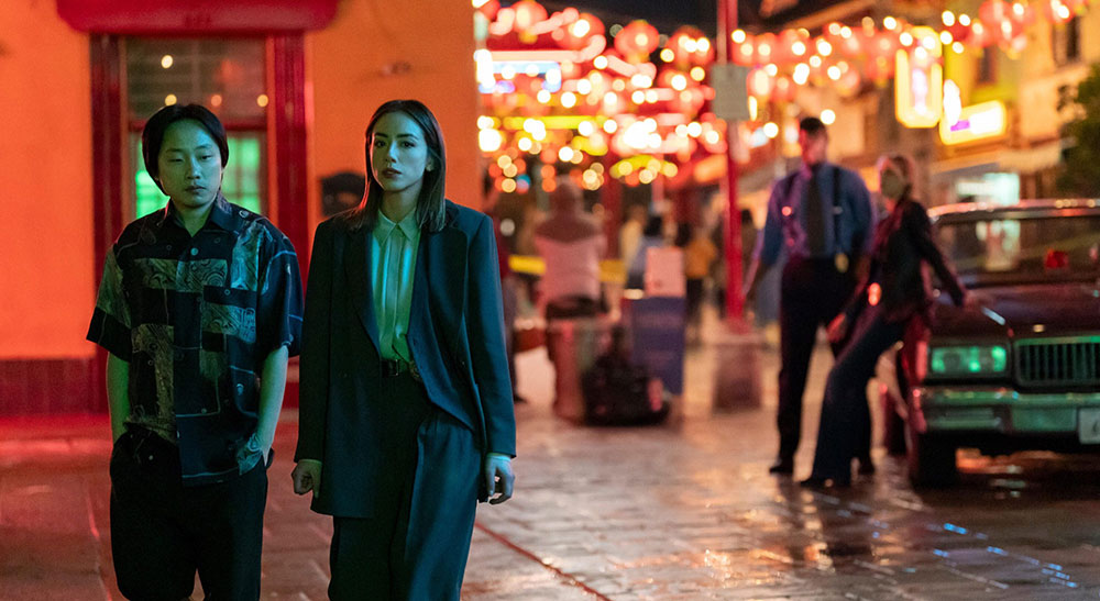
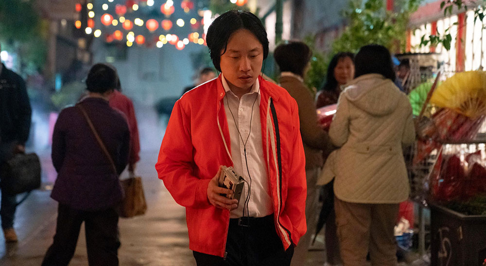
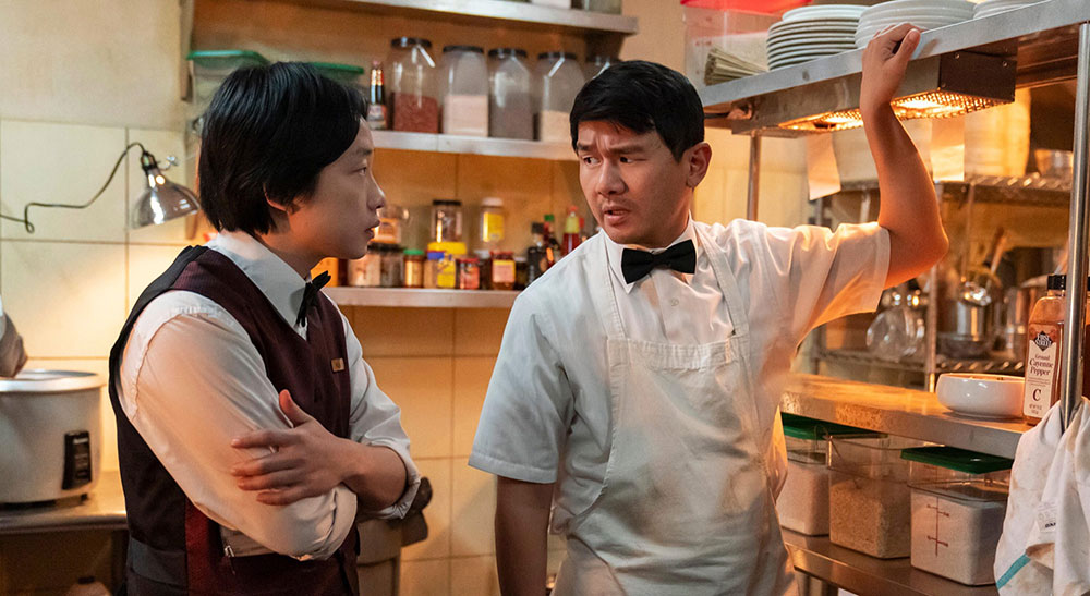
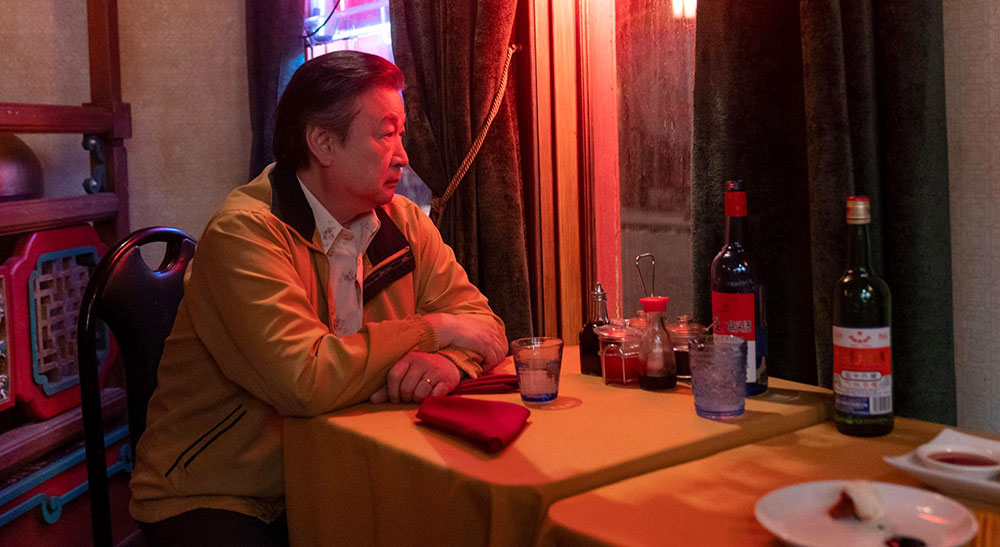
Colourist Aidan Stanford at ArsenalFX Color created and managed a complex grade with distinct looks, transitions and effects in Davinci Resolve to follow the series’ multiple storylines.

TV series Interior Chinatown, streaming now on Hulu, follows Willis Wu, a background character trapped in a police drama series who inadvertently witnesses a crime. The story is based on a novel by Charles Yu, also the series’ creator and executive producer.
The show was graded at ArsenalFX Color by Supervising Colourist Aidan Stanford, working in Blackmagic Design DaVinci Resolve Studio. “Multiple storylines come together in the show, all set apart by different grading approaches, not only in palette but texture as well,” said Aidan. “I was honoured to be trusted with the grade by longtime collaborator and Cinematographer Mike Berlucchi who consistently pushes me out of my comfort zone.
“Cinematographer Tari Segal shot the even-numbered episodes, and was able to give me a great guided tour of her own thought processes as we moved from scene to scene, creating these crazy looks.”
Following Storylines in Colour
He describes the grade as one of the most complicated he’s ever done, forcing him to push himself creatively and take advantage of working with a strong team to help him deliver the standout series. The project belongs to the metafiction genre in which the characters are self-consciously aware of their position as characters in a drama and of what’s expected of them, though their control over events may be fairly limited.

Aidan’s primary task was to create a complex, colourful world for the main characters’ living area, keeping true to the aesthetics of the different storylines. He maintained a vibrant, alive feeling for Chinatown while at certain times applying a Law and Order cop show look, which he described as cool to blue, crisp and saturated, and then transitioned to a more traditional film look later in the series.
“The show LUT was comprised of custom curves and specific saturation controls, especially for Chinatown and the restaurant where most of the show takes place. During LUT testing, our DoP Mike initially found the looks too basic, so I sent him an aggressive version we called ‘full body’, and it was exactly that. It features tons of personality and complexity, with a film style tone map, boosting specific hues of reds and greens while keeping skin tone saturation somewhat normal,” Aidan said.
“In the pilot, the cop show (or ‘procedural’) look comes on as we enter the restaurant, and was used to follow the cop show story around during the episodes, sometimes just in a small part of the frame. This meant that all the shapes [windows] for doing that had to be thought out ahead of time to move in and out of the look."
Management by Group
Aidan organised most of the show’s shots into groups, one of DaVinci Resolve’s organisational features that help manage complex grades like this one. How a colourist defines each group depends on the project, for instance, grouping together all clips from one camera, or in the same location, or from one particular angle. Whatever the criteria, the colourist can now grade all shots in a group at once, or use the feature as a simple way to apply the same balancing operations or particular look to clips for whole scene.

“I placed specific LMTs (Look Modification Transform) – such as cop show, Super 8 and so on – each in a separate node, along with a grain node for that specific look and sometimes a shape I set up to mimick or enhance the edge distortion qualities from the Panavision PVintage anamorphic lens that they shot with intermittently," said Aidan.
Transitions
“There was already a lighting set-up on the stage, where the scene needed to transition in camera. The tricky thing was that this look hadn’t been completely locked for colour or tone. Early on, I had to wrestle with the colour a bit as we settled on the strength of it. Also, the grain goes from a gritty 35mm style to clean as the shot transitions, so that had to happen nicely and smoothly, which prevented building it into one of the group nodes.
“I would sometimes create the looks for transitional shots in a separate group, starting with a clean, generic look (no grain, no edge blur or any other effect) and building in the shot as we enter or leave a look. So, I could add the first or last shot that was going to transition from Chinatown look to cop show look, for example, in a dynamic way using the clip nodes for control.”
Re-using Looks
As a storytelling device, Aidan also imitated a few commercial styles, including a golden, moody, two-toned whiskey ad, a bright, colourful deodorant spot, and a hot sauce commercial reminiscent of a ‘90s early HD video look. Nightmare scenes featured at times, given an apocalyptic style with extra contrast and grain, bloomy highlights and desaturated shadows. “We had so much fun with the creative process and resulting looks as we tried to transition mid-shot from one look to the next,” he said.

“A few times I had to use the looks from prior episodes inside of mattes for monitors, including different grain and different LMTs. A lot of the looks recurred throughout the series, so I had to be organised and thoughtful about my approach. I took a lot of stills and labelled them as I went,” he said. “The use of VFX was also pretty heavy, and for my part I used Resolve OFX for grain, halation, glow and Color Space Transform.”
“Normally the job of a colourist, for me at least, is to interpret captured material and use it to deliver an idea,” he said. “So, for someone who may have limited knowledge of what can be done in colour in the moment, it's an opportunity to get creative. I caught myself saying, ‘Let’s try this, I think I have an idea’ quite often during the sessions. Creating a world that does the cinematography justice and gets the creatives excited has always been the best part for me.” www.blackmagicdesign.com


