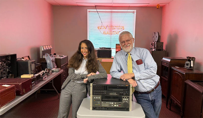
Ross Baker, senior colourist and head of grading at Molinare in London, talks about building his career from telecine departments to running a team working across multiple genres.

SAS: Rogue Heroes
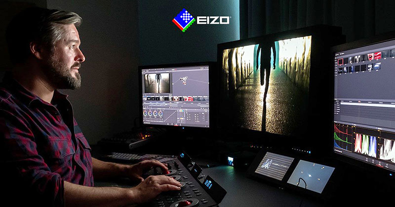
Ross Baker is senior colourist and head of grading at Molinare in London. He has worked on high-end dramas, comedies, documentaries and other factuals. As head of grading, he is also responsible for the tools and infrastructure his team works with.
In terms of his own work, his credits include Sexy Beast (2024), SAS: Rogue Heroes (2022 and 2024), Motherland (2016-2022), The World According to Jeff Goldblum (2019-2021), David Attenborough’s Great Barrier Reef (2015-2016), War of the Worlds (2022) and BBC1/Starz The Missing (2014). He has been nominated for five RTS (Royal Television Society) Programme Awards and has made Televisual’s ‘Top 20 Colourists’ list every year since 2006.
Career Path to Molinare
After leaving school and taking a brief turn as an apprentice car mechanic, he soon realised that this wouldn’t be the career that would fulfil him. Although he had a love of photography and been an early user of Photoshop, he hadn’t considered that a career in colour was a possibility. He landed a job at Metro Lab, starting as a positive assembler in what was basically a runner position.
“About six months into the job, I discovered the telecine department, which I found fascinating. I was working days and nights for four years alongside colourists, eager to get hands-on with the tools. From there, I moved to Pepper, where I took a step back to work as an assistant for some of London’s best colourists. This period was key, as it allowed me to start again and truly develop my craft.
Sexy Beast
“Following my time at Pepper, I joined Vince Narduzzo at St. Anne's Post and later followed him to his own company, Narduzzo Too. From here, I got the chance to start a grading department at halo and build a team from the ground up. I spent 13 years there and worked on a wide range of material, honing my skills in colour grading and understanding the ever-changing needs and requirements of the industry.
“Then, during the COVID lockdown, I was approached by Glen Gathard, chief creative officer at Molinare. Molinare is a company I always wanted to work for and in meeting the creative team, I knew it was a place I could elevate my skills. That’s how I ended up where I am now – head of grading at Molinare.”“I like to be part of the decision-making process and to have valued input into the company’s development. When I started discussions with Molinare, CEO Nigel Bennett quickly saw this potential in me.
Role of Head of Grading
When describing his role, Ross mentioned collaboration and decision-making, of course, but also the need for the team to handle a diverse range of projects. Training and enhancing the team’s skills is important to him as well.
He has always had a collaborative approach to grading, believing that by working well as a team, the studio’s colourists can achieve much more.
“My emphasis is on grading a wide range of genres, which I truly love. I believe that my diverse experience has equipped me with a versatile skill set that I can apply across different projects. Whether it's in a high-pressured environment or a more relaxed one, each experience becomes a unique learning opportunity that helps to raise the quality of my work. Meanwhile, I am also responsible for ensuring that my team is working on projects that they enjoy.”

Vatican Girl
Regarding training, he remarked, “I am very passionate about training the next generation of colourists. I spend time encouraging our colour support team to get hands-on experience with the grading panel and set them various challenges to help them grow.
“I love running and supporting the team, but my primary focus must always remain in the grading suite. I have full support from the managerial team in this, and we have developed efficient communication channels to ensure everything runs smoothly.
“One of the biggest challenges we face is the time allocated to each show. We need to be mindful of what can be achieved within the given budgets and timelines. Balancing the artistic vision with practical constraints is a constant challenge, but it also pushes us to be ultra creative and efficient.”
Baselight’s Toolbox
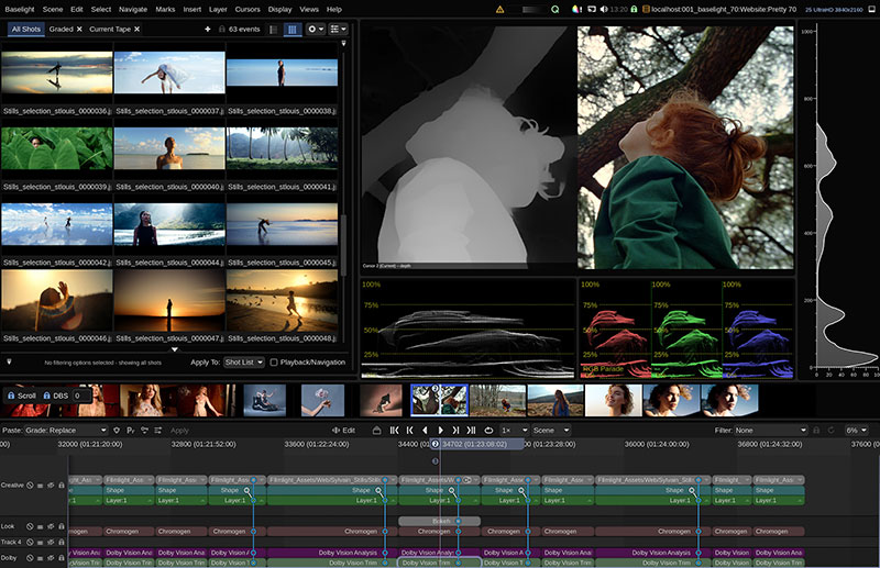
A further aspect of his role is seeing that that he and the team have the right tools and infrastructure in place to deliver top results. He has been grading on Baselight since joining Molinare three and a half years ago. “It was a switch I had been wanting to make for a long time. What I love most about Baselight is the deep colour management and how the tools react. There is a smooth, refined touch when pushing the tools. I also appreciate how powerful Baselight is when working on effects with detailed work.”
He has also been using Baselight 6.0 for a while and considers himself fortunate to have been part of the beta testing team, giving him early access to the new tools and the opportunity to provide feedback. “I'm loving many of the new features. I find the new Curve Grade much smoother, more refined and less destructive. This tool combined with X Grade and the modulation edit function makes for a very powerful combo,” he noted.

SAS: Rogue Heroes
The Curve Grade update encompasses colour-space-aware curve processing that does not rely on LUTs and works with HDR content. It hinges on FilmLight’s new opponent colour space. Opponent colour spaces have three components – a luminance (or black-white) channel, a red-green channel and a blue-yellow channel – resulting in a perceptual RGB colour space that colourists can use to control RGB curves by eye – even when working with scene-referred images with wide dynamic range – and includes accurate handles for users.
The scale-based curves in Baselight’s Hue, Saturation and Exposure are specifically designed for scene-referred image processing, remaining stable and maintaining a uniform look, and are also derived from the new colour space, as is X Grade. X Grade is a primary correction tool that allows multiple, localised corrections in a single layer, without having to create a key or matte. It has a scope display representing the colours in the image and any edits, and can process zonal transforms without using 3D LUTs.
Sandbox Mentality
Ross talked about two of his recent TV projects, Sexy Beast and Inside No. 9, and also shared thoughts about his own grading style, which he describes as ‘adaptive’. “Every show has its unique requirements and styles, and having a fixed look can hinder creativity,” he commented. “I like to approach each grade with a sandbox mentality, exploring the ‘what ifs’ and ‘maybes’. I dislike the idea of acting like an Instagram filter, swiping through LUTs until I see one that fits a show. Instead, I believe in tailoring the grade to enhance the story and vision of each project.”
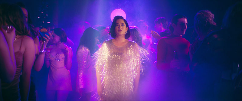
On Sexy Beast for Paramount+, he worked alongside DoPs Birgit Dierken, Ralph Kaechele, and Mattias Nyberg, and series producers James Levison and Matt Barber. The brief was to create distinct worlds for the characters, while maintaining a uniform style.

Sexy Beast
Ross said, “For the day exteriors, we aimed for a mundane, uninspiring look for our character Don's life, using soft contrast and muted tones. Birgit wanted the day interiors to have a slight contrast, making them warmer to reflect the idea that British homes add colour to an otherwise dull outside world.
“As we delved into the night life and the criminal world, we increased the contrast and richness of the colours. We wanted the scenes with significant red elements to have deep, foreboding burgundy textures, symbolising power and wealth.”
From Dark Casino to Sunny Spain
A key scene in the story is the casino, which they treated with a smoky, grimy texture but with vivid colours, balancing contrast and colour density.
A major challenge came in episode four, which was set in Spain. “The weather was so poor on the shoot that we had to work hard to contrast it heavily with Don's experience in England. The goal was to make Spain look stunning and sun-kissed during the day with a jewel-like starry night sky that would make Don feel bewitched by his surroundings.
“Production considered bringing in a VFX team to enhance the skies and inject some sun into the scenes, but first they asked me to mock up a few ideas to discuss with the VFX team. After a few tests they were very pleased with what I achieved with the compositing tool in Baselight – taking skies from other parts of the series or stock elements.
I combined this with other Baselight tools – using ‘Boost’ operators to enhance contrast and saturation as starting points in my primary layer, before adding a slight warm hazy effect, for instance, and then my balance layer followed. I applied the hazy layer by setting the layer blending mode to screen with some diffusion and adjusted the opacity to control the volume of the effect. I also used a combination of the DKey tool, used for creating complex mattes, with shapes to add shadows – helping to sell the strong sunny vibes.”
The Dark Side
Jack and Alice
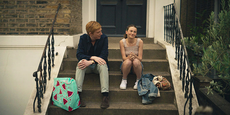
Ross always finds grading Inside No. 9, a black humour anthology program, is always exciting because it creates the perfect opportunity to display a wide range of skills and develop multiple looks within the same series.
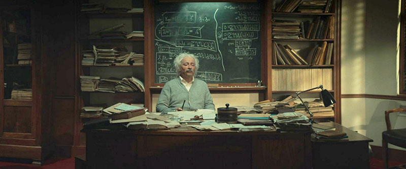
“The show is a testament to filmmaking with outstanding results despite lower budgets,” he said. “It's one of those projects where you can throw out various ideas and see what works. The final series presented challenges, such as turning ARRI ALEXA camera footage into ring doorbell style or recreating a 1970s film stock look. I will miss this series and the creativity it involved!”
Colour and Storytelling
Ross feels strongly about the way colour shapes an audience’s perception of an image. “I can't express enough how important colour is in film and TV. I believe that colour significantly influences how an audience perceives a story or scene. Much of this impact operates on a subconscious level,” he said.
“Colour can subtly convey emotions, set the tone and enhance the narrative. For example, warm colours can evoke feelings of comfort or tension, while cool colours can create a sense of calm or detachment. Even something as simple as a time-of-day mismatch in colour grading can be jarring and take the viewer out of the story.”
Having worked in the post industry since the late '90s, starting with rushes (dailies) on telecine machines at Metrocolor (MGM) labs, Ross has some perspective on the role of colourists, and on how this role has been evolving since that time.
“Back then, we only had basic six-vector and primary grades, mainly balancing for creating looks,” he said. “Now, I feel that colourists have become integral members of the larger creative team, responsible for conveying the story through colours, building emotions and crafting worlds around the narrative.
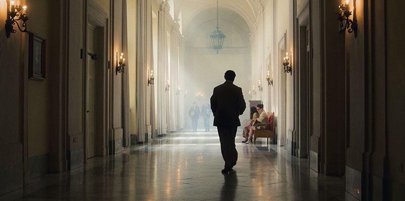
Vatican Girl
“As our tools have developed, so have client requests and expectations. In the past, clients would ask if we could fix something or add an effect. Now, it's less of a request – we are seen as finishing artists, tasked with refining and enhancing the visual storytelling. Moving forward, I believe the role of the colourist will continue to evolve with technological advancements that allow us to push the edges of creativity further.”
Aspirations
Ross’ advice to young colourists starting out is simple, but not easy. “Find a genre you would like to work in, secure a job at a company and work your way up to grade assistant. Build relationships with the colourists and learn from them. Explore all the tools and practice whenever you can,” he advised.
“Be cautious of following video tutorials on YouTube, as some can be misleading. Remember, it's not a quick path to becoming proficient. Clients are trusting you with months or even years of their work, and you have a finite time to deliver – keep this in mind when they make difficult requests.” www.filmlight.ltd.uk


