
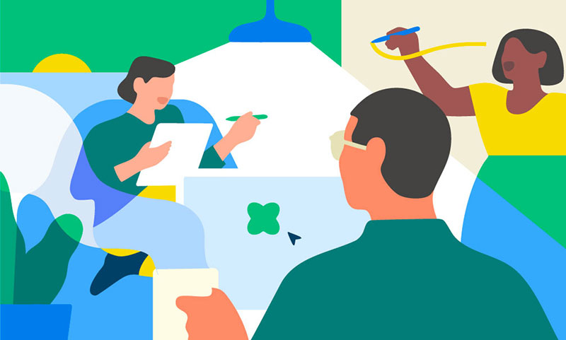
LinkedIn's celebration graphics – making the milestones in people’s careers come visually to life – have had a recent refresh with new graphics, look and animations from BUCK.
LinkedIn's celebration graphics make the critical moments in people’s working lives – career milestones like new jobs, certifications, project launches and work anniversaries – come to life visually. These animated graphics have recently gained a new lease on life with a complete redesign, created in partnership with BUCK.
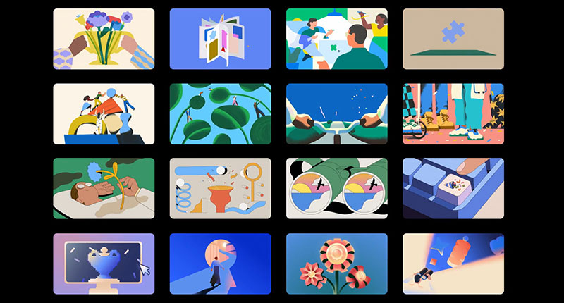
From the start, it was important to LinkedIn that BUCK keep the designs simple and fun to look at, and to make sure they delivered an immediate, recognisable message to the more than one billion LinkedIn users around the world. The BUCK team tackled the project as an illustration system, which Art Director Twisha Patni described as a structured approach that ensures all 16 illustrations work together as a cohesive set, rather than a collection of standalone artworks.
LinkedIn’s brief also emphasised their move toward a more sophisticated visual language – fresh and human, but still professional. The illustrations needed to feel more emotionally aware and intentional than their previous brand work.
Two Tasks
“The ask was twofold – to develop an illustration and motion system that feels expressive and resonates globally, while also reflecting LinkedIn’s evolving brand direction. Our client was looking for accessibility and inclusive gestures, wanting to avoid rigid corporate visual tropes,” Twisha said.
Because the assets are intended for in-feed use, the animations had strict file size requirements. Those constraints led to a minimalist approach to the animation – a calm, confident style with subtle loops, ambient motion and small character or object gestures that added life without distracting the eye or overwhelming the user experience.
“The illustrations and animations share visual ingredients, colour rules and motion principles. This meant we could create variety in terms of tone and metaphor, while keeping the brand identity consistent and recognisable within the LinkedIn environment,” said Twisha.
Truly Global
The fact that LinkedIn’s audience is truly global posed a few challenges as well. BUCK’s metaphors needed to be visually clear and resonate emotionally across cultures. She said, “We leaned into simple, universal themes like inspiration, collaboration, achievement and innovation, and then reviewed every theme and metaphor from a global point of view, making sure it would be understood intuitively, regardless of where the user is located or what industry they work in.”
To help, colour serves as a natural way to speak a universal language. LinkedIn blue was used consistently as a grounding element across all illustrations, and around that, a palette of neutrals and accent tones was built to support clarity, express mood and define the metaphors. From there, the colour used in each piece reinforces the tone of the career milestone the user wants to celebrate – whether serious, reflective or playful.
“To stylise the characters and objects, we chose abstracted figures and clear silhouettes with simple gestures to make them relatable. This allowed us to prioritise inclusivity and emotional tone without defining the characters too narrowly. Thus, stylization was the default approach, and realism was used only when necessary for clarity.
Creative Exploration
“Clear and thoughtful, the LinkedIn team was incredibly receptive to creative exploration. They shared moodboards and reference material to visualise their new brand vision, including editorial illustrations, their other design campaigns and current product visuals. We took a lot from the previous Celebrations imagery. These had been rooted in geometrical circles, squares, clean shapes and we now wanted to evolve that language without abandoning it.”
Ready to go, BUCK then proposed new stylistic directions, ideas for metaphors and tone strategies that aligned with LinkedIn’s goals. BUCK’s Strategy team organised the project in detail. They first defined four key design attributes built around the idea of ‘form and feeling’ - balancing precision with human emotion to build trust and connection among professionals worldwide.
The first attribute was Open, calling for clear, uncluttered compositions that reflect trust and authenticity, and include subtle use of LinkedIn blue in every illustration to maintain cohesion. Active referred to a bold, energetic approach to show the ambition, innovation and forward momentum of professional progress. Fluent in this case means culturally resonant and adaptive, built to work across global perspectives and industries as well as milestones. Finally, Empathetic added an aspirational, optimistic element, celebrating the human side of work that welcomes both individuals and collective connection.
“Then we established our four creative constants to anchor the system. As mentioned, subtle use of LinkedIn blue in every illustration maintained cohesion. Metaphors gave us impact and meaning, forming a bridge between the variations in personality and tone, and led to interesting takes on familiar visual cues. The compositions make intentional use of space to establish universal connections with people. To reflect users’ sentiments, we used relatable, inclusive gestures and diversity to create warmth through human expression.”
These design attributes and creative constants helped them evaluate every visual against LinkedIn’s values and user expectations. Alongside those, they also set up an emotional spectrum ranging from calm to expressive, and used it to map each celebration moment to the right tone.
“For example, a certification might call for something more structured and grounded, while a new job could feel more dynamic and upbeat,” Twisha said. “Having this spectrum allowed us to plan for variety and balance across the full set of 16, producing a diverse emotional range without letting the style drift. On the practical side, it also supported the Celebration feature’s UX, where users can choose the visual that best fits how they want to celebrate.”
Curating Styles
BUCK’s Lead 2D Animator Juan Ric Hernandez also talked about curating and managing the stylistic drift and variety across the project. “Some assets called for a more vector based approach while others leaned into something more organic,” he said. “That’s why some of the design work was done in Adobe Photoshop, especially the ones using textures, while the cleaner pieces were created in Illustrator. For animation, we could handle everything in After Effects, though we did a few early cel passes in Adobe Animate to really hone in on motion that felt restrained, expressive and very human.”
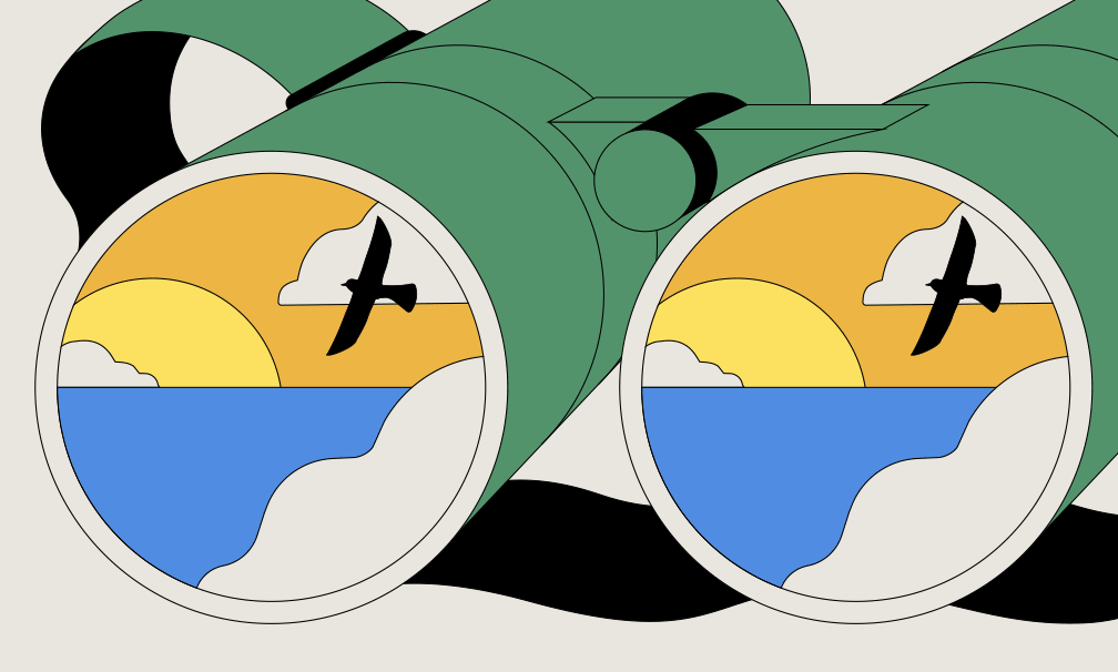
Inevitably, some of the illustrations proved more challenging than the others. “Four in particular were intended to be the most metaphoric and moody, and turned out to be the trickiest both to design and to animate,” said Juan. “Looking at the computer, the keyhole portal, the ribbon flower and the binoculars with dimensional shapes – because they are more atmospheric and rich in gradients, finding the right look and that ideal balance between dreaminess and clarity took many iterations.”
Pushing Technical Limitations
There were also the technical limitations tied to the file format that the designers had to keep in mind for animation, one of the main ones being file size. Once the design struck the right visual balance, the challenge shifted to animation. Guardrails had been set early on to make sure everything would be technically feasible, but BUCK’s designs really pushed those limits.
Juan said, “Because each design was so rich and layered, they already consumed a large portion of the file size we had to stay under. From there, it became a balancing act, experimenting to find motion that felt meaningful and elevated the design, while staying within the constraints. For many of these, we were literally counting every kilobyte and pulling every trick in the book to bring them to life.”
They devised a series of passes to create the designs systematically and end up with JSON files that were small and light enough for fast data parsing and transmission. First a cel pass was created to lock the performance, followed by a shape layer pass to clean up the cel. The team then built a texture sheet from a sequence of three png files to limit JSON file size, and applied that texture sheet to all characters, adding position, rotation and masks.
This work was finally refined and optimised for a lightweight JSON file. This JSON format would be used to encode the design and animation data, and pass it between systems without needing to execute any of the code, leading to quicker loading times and a more responsive user experience.
Favourites
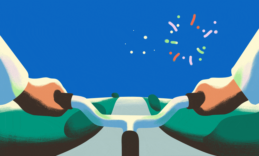
Juan finds it difficult to choose favourite designs from the final batch. “They all have something that makes them unique and satisfying in their own way. That said, my absolute favourite animation is the bike riding with fireworks. It feels genuinely celebratory and has such a rewarding loop,” he said.
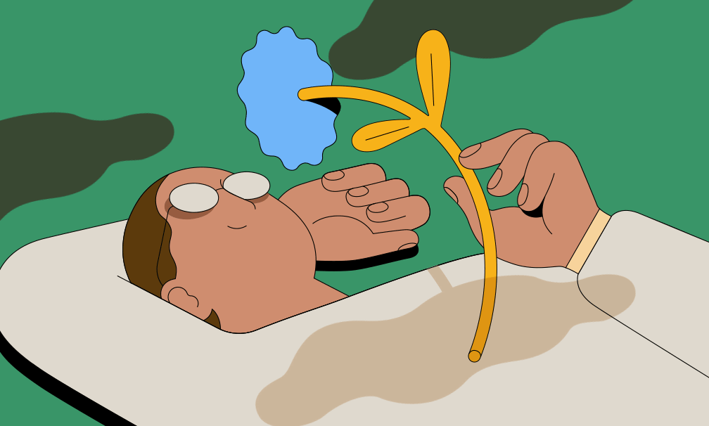
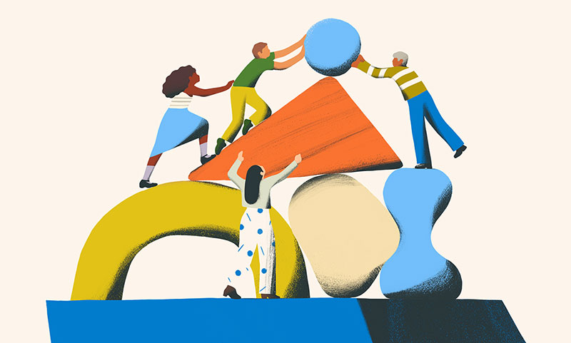
“Another favourite is the piece with the people moving a boulder on a stack of shapes, along with the person smelling the flower. The boulder animation went through many rounds as we tried to convey a sense of achievement in just a few frames. Early versions almost came across as frustration, which ironically mirrored how we felt while figuring it out. Once we found the right rhythm, it finally captured the concepts of teamwork and accomplishment.
“The person smelling the flower had a simplicity I really liked. The idea of pausing and noticing small things felt genuine and relatable, and once it was animated, it had a calm, satisfying flow to it.”
Seeing how the artists manipulated the scale between the characters and other abstract or everyday objects in the scenes is slightly unexpected, and fun. Juan commented that playing with scale was a way to keep things open and abstract, without getting overly detailed or literal. He remarked, “Instead of realism, exaggerating proportions between characters and shapes let us focus more on emotion and atmosphere. It also gave the figures a more universal quality – inclusive, symbolic and expressive but not tied to any one identity.” buck.co
Words: Adriene Hurst, Editor


