

In this 3-part series, senior colourist Sam Chynoweth at The Farm talks about grading the most recent season of ‘Black Mirror’, delivering an independent look for each episode.
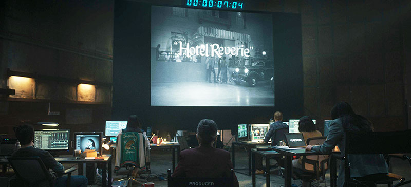
This article is the second in a 3-part series, in which senior colourist Sam Chynoweth at The Farm post studio in London talks about colour grading the most recent season 7 of television series Black Mirror, giving an independent look to each episode. Each article covers the grading work for a different episode in depth. Look out in our upcoming Newsletters for part three, and find part one here.
Hotel Reverie is the third episode of Black Mirror’s season 7, directed by Haolu Wang and shot by DoP Philipp Haberlandt. Here, colourist Sam Chynoweth shares the techniques he used for the colour grade, helping to tell its complex story as it shifts between time periods, and real and virtual worlds.
In the story, actor Brandy Friday is hired by an entertainment technology company to star in a remake of a classic romantic film from the 1940s, Hotel Reverie. However, instead of using conventional film production techniques, the producers plan to transfer her consciousness into the world of the film using an immersive AI-based virtual production technology called ReDream.
In this virtual world, she interacts with digital replicas of the film's original characters, while the complete story is filmed live, like a play. Not surprisingly, the process doesn’t proceed quite as planned, giving the Black Mirror creators a chance to delve into the ethical implications of AI in filmmaking, and the potential for blurring the lines between reality and simulation.
Authentic Recreation
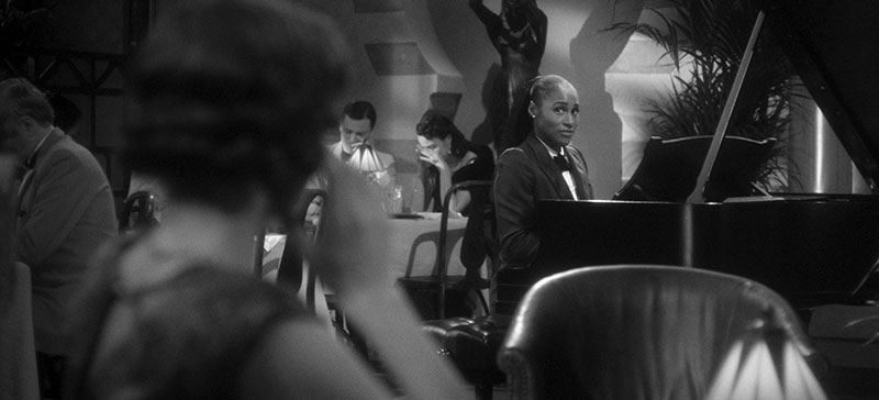
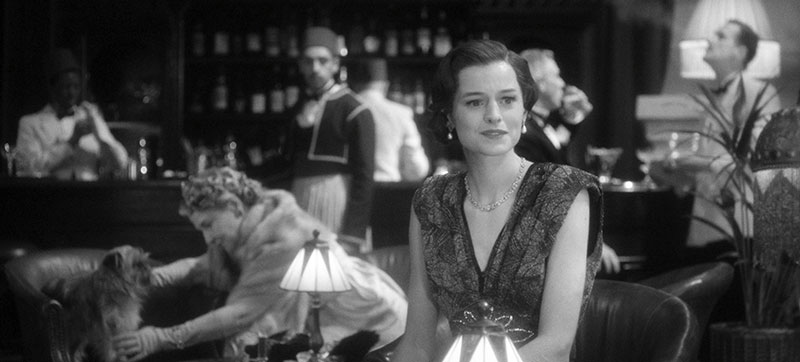
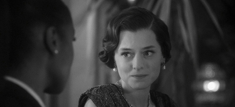
For Sam, the goal for this episode was an authentic recreation and reinterpretation of the visual aesthetic of a 1940s black and white classic film. “It was a homage to films like Casablanca and Brief Encounter,” Sam said. “We wanted to use the grade as a storytelling tool to reflect the shifting narrative layers and environments of the episode.
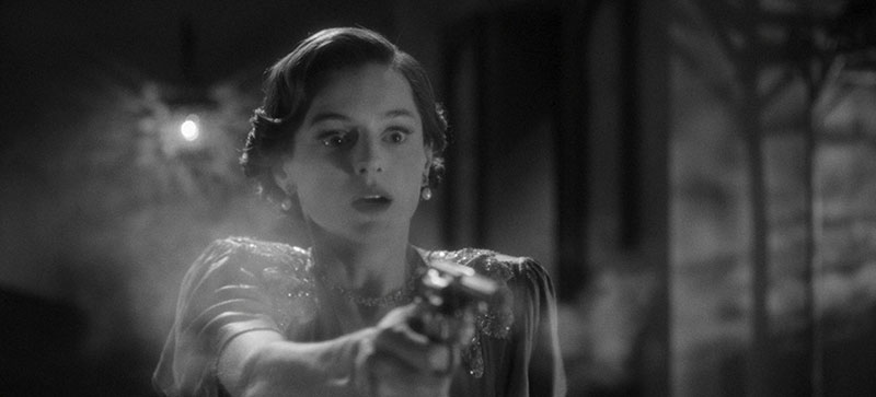
Rather than a single, static black and white look, the challenge was to design and clearly differentiate three separate versions, each of which served a different conceptual or narrative purpose. They started with a look resembling an original 1940s print - faded, shaky and with coarse levels of grain.
Three Looks
“This was the ReDream simulation designed for Brandy’s immersion and was our most damaged version of Hotel Reverie,” said Sam. “Aiming to stay true to the source material, it allows for some flicker, light scratching and dust particles, while maintaining a good, overall level of clarity and detail.”
At a critical moment, a technician at the film studio spills coffee on one of the computers running the simulation. Everything in the virtual world freezes – except the two protagonists. Brandy and the producers cannot communicate, and she becomes trapped in the simulation, unable to leave until she cues the credits to roll by speaking the last line of the script and ending the story.
When the accident occurs, we see the simulation lose the ability to recreate the digital elements that mimic the look of celluloid film, and revert back to a cleaner, more modern rendition of the world. That reversion coincides with the change in camera and lighting language the director Haolu and the DoP Philipp used to visualise the moment.
“Finally, we have our Blu-Ray version, remastered for Streamberry, a fictional streaming service within the Black Mirror universe – cleaner, sharper and now in widescreen. We gave it a higher contrast and removed all but the finest grain,” Sam said. “In essence, the grading served as both a homage and meta-commentary, guiding the viewer through the narrative reality of the episode.”
Finding a Visual Identity
Recreating the look and atmosphere of a golden era black and white film takes a lot more work than just stripping the colour out.
Collaboration with Philipp Haberlandt and the creative team was essential for Sam to achieve the episode’s visual identity. Because recreating the look of a classic film was a key goal, Philipp shot a range of tests to explore elements like lighting and lenses as well as period-accurate hair and make-up.
“We tested various lenses, filters and techniques from that time to achieve the classic aesthetic Haolu Wang and I were aiming for,” Philipp said. “The test footage provided the perfect foundation for creating a LUT that would emulate a film emulsion from that era.”
The team then reviewed these tests in the grading suite to assess which combinations best captured the era’s authentic texture, contrast and tonal balance. Details like lens halation, skin rendition and shadow detailing were carefully considered to support the monochromatic look.
“One of the key tools we adopted was a heavy orange filter, which helped to lower the contrast within skin to create the soft glowing glamour tones of the era while maintaining a pleasingly strong overall contrast,” Sam noted.
A Visual Anchor – Three Custom LUTs
These tests helped define the grading strategy. Early on, they tested three black and white LUTs – monochromatic, orthographic and panchromatic – to see how each rendered tone and contrast. He said, “Mono and orthochromatic options created a striking, vintage look. But they had strong implications for makeup and lighting: for example, red lipstick could register unexpectedly dark, and certain fabrics or skin tones could lose detail or tonal separation.
“After seeing these results, we opted for a more controlled desaturated approach, blending it with subtle RGB channel tuning to shape the contrast in a way that felt period accurate but more adaptable for the needs of the production.”
The lenses (Super Baltar), combined with the varying use of diffusion filters like Soft Net and Black Satin, along with the LUT, produced the authentic look the production was striving for.
For their two other major looks, the team looked to a different era of Hollywood. “Our modern ‘real’ world look has a palette heavily influenced by modern film stocks, but with a slightly more open shoulder [that is, the point in the curve where highlights lose contrast and flatten, but don’t blow out completely] making use of the extended dynamic range available in HDR,” said Sam.
“For the moment when Clara is exposed to her memories, we wanted to create the sense of colour leeching into her life, but still with a heavy sense of nostalgia. The look we settled on is reminiscent of faded newspaper, made by blending our modern and black and white looks.
“Our three LUTs developed during testing travelled through the entire shoot, acting as a visual anchor, and became the foundation of our final creative grade. It ensured that all departments were aligned from capture through post, and that our final look felt cohesive and intentional.”
Balancing Authenticity with Storytelling
Look management continued as a substantial part of Sam’s role on this episode. One of his key challenges was managing the levels of artefacts to apply to the look throughout. “Working with the series creator Charlie Brooker, we developed a detailed set of rules that dictated how much texture, degradation and stylisation to apply at each narrative stage, striking a careful balance between authenticity and storytelling clarity,” he said.
“For example, the grade and film damage were at their most evident for the opening Hotel Reverie trailer, in an effort to make it feel like an authentic found film. In the simulated ‘1940s film’ version, we continued to add elements of degradation, but were slightly more conscious of their placement – and never took them to a level that would distract from the scene.”
The team was also conscious that streaming services are designed to optimise their delivery of images to the viewer. However, aware that grain is at odds with efficient image compression and may be reduced during encoding, they debated whether they needed to overcompensate the grain levels to balance out for that effect. Fortunately the post team at Netflix was able to create a streaming master that preserved their intent.
“The challenge wasn’t just in creating these looks individually, but in ensuring their transitions felt narratively driven,” Sam reflected. “Each version had to serve the story, not distract from it. We also had to take care that elements matched across departments, making sure the level of affectation matched across both sound and picture.”
A Film Within a Film
Another challenge was maintaining visual consistency across all the different in-story playback devices – monitors, projectors, and digital interfaces. “By pre-grading the film as a unified piece, we could lock in the grain, damage and overall texture so it remained cohesive regardless of where or how it was displayed,” he said.
“This also gave the VFX team a reliable base to work from when compositing the film into the different environments, whether it was projected on a vintage screen, or playing on a futuristic Streamberry interface.”
For Haolu and Philipp, it was crucial that the episode always felt like a complete, authentic film in its own right, and remain as authentic as possible from moment to moment. Sam gave it the same attention and structure as he would a standalone period feature, carefully sculpting the lighting, era-specific contrast and a controlled grain profile that resembled a 1940s film stock.
“I worked directly with them to enhance the lighting effects, like the ‘spot-lit’ aesthetic typical of the era, making key areas pop with theatrical contrast,” he said. “Close-ups of the female leads were given a softer, brighter treatment, true to classic glamour cinematography, while wider shots and male characters retained a more neutral contrast and sharpness.”
Nimble Playback
For all of these quite technical demands, The role of his grading system Baselight was to make sufficient flexibility and scope available to Sam. “Beyond its robust colour tools generally, we made frequent use of Baselight’s support for OFX plugins and title compositing, allowing us to build more complex looks directly in the timeline without bouncing back and forth between platforms,” he commented.
“One of Baselight’s biggest advantages was the ability to play back heavy grade stacks in real time. With so many layers of grain, damage, glows and custom LUTs, viewing and refining those looks interactively made the grading process much more efficient and responsive, especially as we adjusted fine details like scratch and dust placement across the various versions of the film.”
Regarding the pipeline for VFX plate delivery, the scene management and export tools in Baselight made it straightforwad to track, version and share graded plates with the VFX team – helping maintain consistency and speed up communication between departments. Sam said, “The clean exchange of scenes meant we could work in tandem with other teams, without ever losing sight of the creative intent or visual continuity.” www.filmlight.ltd.uk


